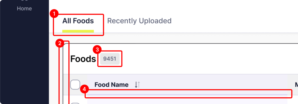

To truly understand and design the best possible information architecture for an application or website, find the biggest whiteboard in your office and start drawing.
There’s simply nothing better than freeing yourself from the confines of a computer screen or diagramming software and focusing on what is really important—design. Common interface components will bubble up and reveal themselves, allowing you to start thinking about a standardized way to design those components. When the interface components use consistent design standards, users can quickly learn how to use them as they appear on different screens and sections of the app. Creating a common nomenclature will also become apparent as you write different section names, navigation menus, and labels.
A whiteboard allows you to physically step back from the diagram and see things you may not otherwise see on a computer screen, such as recognizing the relationships and interconnections between seemingly disparate sections of the application. Seeing the “Big Picture” helps you design the overall User Experience by creating a context for all the individual screens and components you need to design as you get deeper into the product.
So, find that whiteboard, grab some smelly markers, and start drawing!
| Cookie | Duration | Description |
|---|---|---|
| cookielawinfo-checkbox-analytics | 11 months | This cookie is set by GDPR Cookie Consent plugin. The cookie is used to store the user consent for the cookies in the category "Analytics". |
| cookielawinfo-checkbox-functional | 11 months | The cookie is set by GDPR cookie consent to record the user consent for the cookies in the category "Functional". |
| cookielawinfo-checkbox-necessary | 11 months | This cookie is set by GDPR Cookie Consent plugin. The cookies is used to store the user consent for the cookies in the category "Necessary". |
| cookielawinfo-checkbox-others | 11 months | This cookie is set by GDPR Cookie Consent plugin. The cookie is used to store the user consent for the cookies in the category "Other. |
| cookielawinfo-checkbox-performance | 11 months | This cookie is set by GDPR Cookie Consent plugin. The cookie is used to store the user consent for the cookies in the category "Performance". |
| viewed_cookie_policy | 11 months | The cookie is set by the GDPR Cookie Consent plugin and is used to store whether or not user has consented to the use of cookies. It does not store any personal data. |