Why I chose droid Vs iPhone
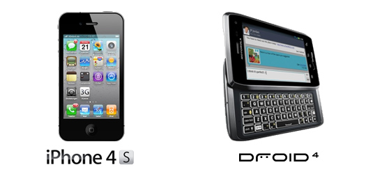
I spent a ridiculous amount of time researching all the pros and cons between the Droid 4 and iPhone 4S and I’ve concluded that there are simply too many things I would be giving up if I got the iPhone.
Since this is a UX Design Blog, I thought it might be good to share my personal reasons for choosing the Droid 4. Keep in mind, that these reasons are exactly that—personal reasons. Also keep in mind that I am and have been a Mac user since the Macintosh IIfx so I am by no means a fan boy of Android. For me, choosing a phone was based solely on my own personal reasons and I understand that my reasons may not make sense to everyone…but here they are:
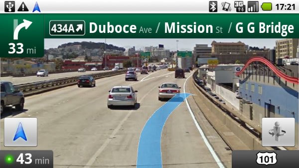
Google Navigation
I’m a father of two active boys and I use Google Navigation (a free turn-by-turn voice guidance GPS) in my car to drive to all my kid’s lacrosse fields, boy scout camps, marching band competitions, etc… What makes Google Navigation so good (and so hard to give up) is not only that it’s 100% free but it’s also integrated with Google Maps. When I’m on my laptop, I use the “My Places” feature in Google Maps to create and organize different Maps for all the locations I drive my kids to. And, when we go on vacation, I create a Map for all the sight seeing places, restaurants and places we may want to visit while we’re there. Doing all the organizing on my laptop makes user experience easy when I’m using my phone because all I need to do is launch Google Maps, select “My Maps”, then choose “Lacrosse Fields” or “South Beach” and click on the saved location on the Map.
Car mode
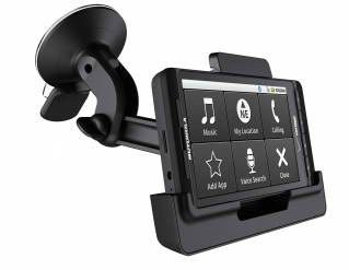
Whenever I get in my car, the first thing I do is snap my Droid into the car dock, which is suctioned to my windshield. When I do this, the Android OS automatically detects that the device has been docked and it switches the interface to display only the essential apps you may need when you’re in your car. To make the User Experience even better, the icons are large and easy to select when driving.
Clock mode
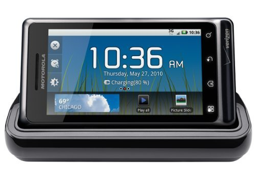
Every night I plug my Droid into a Multimedia Docking Station on my night table to charge it. When I do this, the Android OS detects that the device has been docked and it switches the interface to display mainly as a large clock. It also displays the current weather, how much the battery is charged and icons for alarm clock, slide show and music. As an added touch, it also dims after a few minutes and displays only the clock.
4G LTE
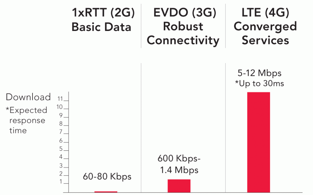
Having a 2+ year-old Droid 1 with 3G download speeds has grown old. So if I’m going to get a new phone, I don’t just want the phone to work faster, I’m going to want the download speeds to be faster too.
I would say that the speed improvements are so significant, it may be reason enough to get a 4G LTE phone—if download speeds are your #1 concern.
Qwerty keyboard
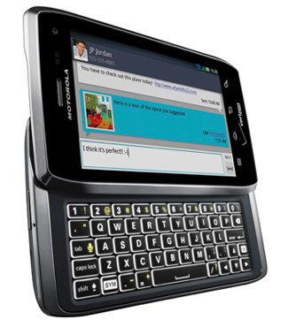
The keyboard on my iPod Touch is really fantastic and it’s way better than my Droid’s onscreen keyboard but there’s simply nothing better than typing on a real, tactile QWERTY keyboard.
MicroSD card
When I had to replace my original Droid 1 phone because of a power supply issue, I removed the Micro SD card in my old phone, plugged it into my new phone and all my apps were ready to use on my new phone. Plus, having a removable SD card allows you the freedom to expand to more memory whenever you need to—something you can’t do on the iPhone.
On-device key buttons
Unlike the iPhone, most Android devices have key buttons directly on the device that allow you to:
- Go “back” to the previous screen in the app you are in or the previous screen in the previously opened app.
- Go “home” to return to the home screen
- Access a global “search” across all apps and files on the device
- Access a “menu” for options or settings while you are in an app or on the home screen.
The iPhone only has one on-device key button— a “home” button. Now, I am all for a minimalist design, but not having the other on-device key buttons means the iPhone must rely heavily on the hope that individual app designers will design usable interfaces—and, unfortunately, a lot of times they don’t. In addition, having a “back” button on the device is similar to the familiar User Experience of a web browser. All web browsers have a “back” button because it provides users with a way to return to the previous screen without having to rely on whether the website’s designer created a usable navigation system.
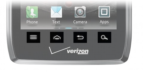
My only complaint with the Droid 4’s key buttons is that they changed the order that they display. The order of the key buttons on my original Droid 1 was: Back | Menu | Home | Search. The key buttons on the Droid 4 shown above are: Menu | Home | Back | Search. I really think the back button should always be on the far left (much like it is in any web browser) because A) the arrow points left and users associate “back” or “previous” pagination with going left and B) this is the only key button that has a direction connotation, so I think it would make the most sense for the button to always be placed on the far left.
Send to phone
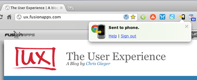
“Send To Phone” is a Google Chrome extension, which lets you push links, maps, and currently selected text and phone numbers from the Chrome browser on your computer to your Android device. I never thought I’d use it either but once I did, I find myself using it more than I ever thought I would before.
I have an iPod touch
An iPod Touch is essentially an iPhone without a phone so I can already use most of the things that come with an iPhone. Plus, as a UX Designer, having both iOS and Android devices is very helpful and important because I am able to see and learn what the User Experience is like on both devices and apply that knowledge to the mobile apps I design.
My wife
My wife also needed a new phone, so I bought two Droids and now we can share chargers, docking stations and other peripherals. She’s also migrating from an old Samsung Alias II with a full physical QWERTY keyboard and she hates typing on an onscreen keyboard. Even though she’s gotten used to typing on our iPad, she still hates it.
…And, here it is:
http://youtu.be/S_zUuLZ38Kg
Tell me what you think? What phone do you have and what made you decide to buy that one over others?


