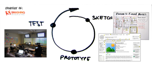
The UX Process and UX Design principles
A web application’s design and usability is just as important as that application’s functionality. If users can’t immediately figure out how to use a web application, then we haven’t done our job correctly.


A web application’s design and usability is just as important as that application’s functionality. If users can’t immediately figure out how to use a web application, then we haven’t done our job correctly.

The concept is simple enough: Take the time to do something right the first time and you will inevitably complete the task faster and better than if you rushed it to “just get it done”.
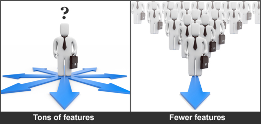
It seems almost impossible for most software and website companies to resist the urge to add the kitchen sink of features and functions to their products. To this, I say, “Stop the madness!”

The Blur Test is an old art school technique used to reveal a design’s focal point and visual hierarchy. Let’s see how Go Daddy holds up to The Blur Test.

Focus Groups and Usability Tests are often mistaken as being the same thing when in reality they really could not be more different.
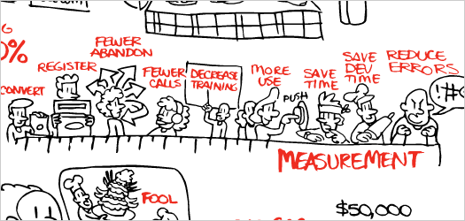
This is a great video from Susan Weinschenk (Chief of UX Strategy at HFI), which illustrates what many of us UX professionals preach on a regular basis—the value of User Experience.

Innovation is defined as “the introduction of something new” and when most people think of Apple, they think of an innovative technology company. We disagree.

Over the years I’ve interviewed a lot of talented User Experience Designers and, in doing so, I’ve also heard a lot of interesting quotes come out of these interviews.

Other than your computer, your phone is probably the most used piece of equipment in your office—yet I bet most people don’t know how to use 80% of its features.

I just revisited a tweet I posted 300+ days ago, which points out a design flaws with Facebook’s use of redundant comment buttons. They have since removed the buttons.

A web application’s design and usability is just as important as that application’s functionality. If users can’t immediately figure out how to use a web application, then we haven’t done our job correctly.

The concept is simple enough: Take the time to do something right the first time and you will inevitably complete the task faster and better than if you rushed it to “just get it done”.

It seems almost impossible for most software and website companies to resist the urge to add the kitchen sink of features and functions to their products. To this, I say, “Stop the madness!”

The Blur Test is an old art school technique used to reveal a design’s focal point and visual hierarchy. Let’s see how Go Daddy holds up to The Blur Test.

Focus Groups and Usability Tests are often mistaken as being the same thing when in reality they really could not be more different.

This is a great video from Susan Weinschenk (Chief of UX Strategy at HFI), which illustrates what many of us UX professionals preach on a regular basis—the value of User Experience.

Innovation is defined as “the introduction of something new” and when most people think of Apple, they think of an innovative technology company. We disagree.

Over the years I’ve interviewed a lot of talented User Experience Designers and, in doing so, I’ve also heard a lot of interesting quotes come out of these interviews.

Other than your computer, your phone is probably the most used piece of equipment in your office—yet I bet most people don’t know how to use 80% of its features.

I just revisited a tweet I posted 300+ days ago, which points out a design flaws with Facebook’s use of redundant comment buttons. They have since removed the buttons.
| Cookie | Duration | Description |
|---|---|---|
| cookielawinfo-checkbox-analytics | 11 months | This cookie is set by GDPR Cookie Consent plugin. The cookie is used to store the user consent for the cookies in the category "Analytics". |
| cookielawinfo-checkbox-functional | 11 months | The cookie is set by GDPR cookie consent to record the user consent for the cookies in the category "Functional". |
| cookielawinfo-checkbox-necessary | 11 months | This cookie is set by GDPR Cookie Consent plugin. The cookies is used to store the user consent for the cookies in the category "Necessary". |
| cookielawinfo-checkbox-others | 11 months | This cookie is set by GDPR Cookie Consent plugin. The cookie is used to store the user consent for the cookies in the category "Other. |
| cookielawinfo-checkbox-performance | 11 months | This cookie is set by GDPR Cookie Consent plugin. The cookie is used to store the user consent for the cookies in the category "Performance". |
| viewed_cookie_policy | 11 months | The cookie is set by the GDPR Cookie Consent plugin and is used to store whether or not user has consented to the use of cookies. It does not store any personal data. |