The disappearing email preheader
For the last few years, marketers have used ‘teaser text’ to give users a sneak peek of an email’s content. Email clients on mobile as well as desktop devices pull that teaser text from the first line of the email body. Lately, we’ve found that the teaser text is often invisible in the email. Knowing that 56% of emails are opened on mobile devices1, we can guess why.
1Source: https://litmus.com/blog/mobile-friendly-email-september-2016-email-market-share
Given the limited amount of space available on mobile devices, it’s no wonder that marketers don’t want to waste the prime real estate at the top of emails.
Consider this example:

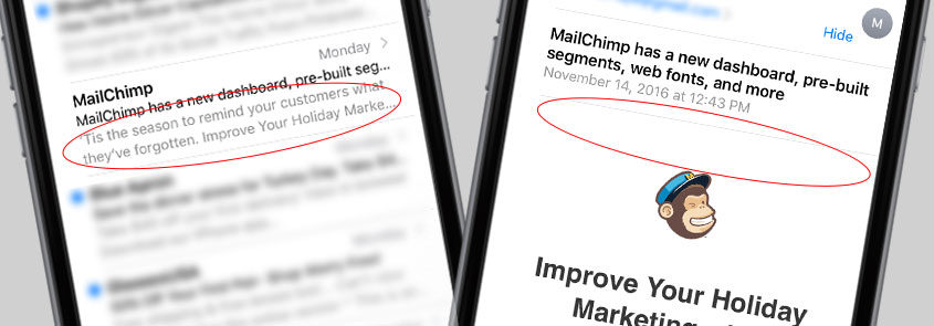
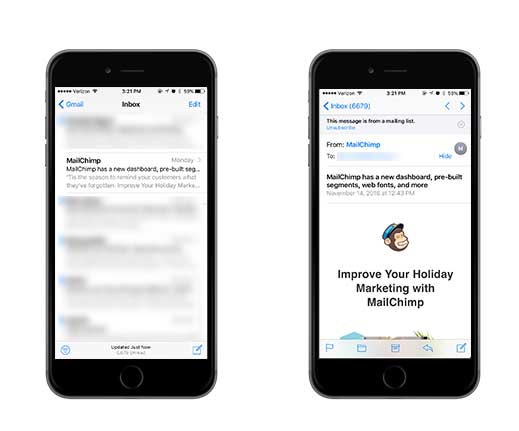
MailChimp recently sent a marketing email promoting their new dashboard. In the image on the left of a mobile email client, you can see the teaser text. However, it’s not visible in the image of the email content on the right. The line is actually in the email body, but it’s hidden from the display using CSS. The result is a clean layout with no distractions.
Litmus currently reports the iPhone as the email client with the highest market share2. Thanks to iOS 10, we now have a big gray bar at the top of our marketing emails telling us “This message is from a mailing list”. This means we now have even less space to work with in our email layouts.
2Source: https://emailclientmarketshare.com

The verdict: If the teaser text doesn’t enhance the user experience, hide it!
What about “View in browser” links?
You’ll notice that the ‘view in browser’ link is also omitted from Mailchimp’s email above. In the dark ages of HTML emails, email client support was certainly a challenge. We all did our best, but for the stragglers still using ancient software (I’m looking at YOU, Outlook 2003), we added a link to view the email as an HTML page.
…But is it still necessary? Because of the high percentage of mobile email opens, many marketers are opting for simple layouts that look great on any device, email client and browser. Plus, email client support continues to improve.
Two things to consider when deciding on whether to keep the ‘view in browser’ link are:
- Usage – how many users have been clicking the link?
- The complexity of your email. Is there anything in your email’s code that isn’t widely supported? Campaign Monitor has a handy guide for CSS support in emails
The verdict: If your email is simple and few or no users have clicked the link, there are better ways to use that space.


