
Figma wishlist 2023
In September 2022, Adobe announced its plans to acquire Figma, the most popular tool among UX Designers (according to a 2022 UX Tools Survey). The announcement left many designers shocked and wondering what would come next. Will Adobe incorporate the best features of Figma into XD and kill it, or vice versa, or keep them as two separate products?
Adobe has said that they plan to have Figma continue to operate autonomously, so we think it’s safe to say Figma will continue to operate for at least the foreseeable future. While many designers have lamented the acquisition, we think it presents an opportunity to bring the best parts of Adobe XD into Figma and accelerate the release of a few other enhancements as well.
Here is our wish list of things we hope to see from Figma in 2023:
Repeat grid
If there is anything that XD does well, it’s repeat grid. Repeat grid allows you to create an element and simply drag out the container to repeat the element horizontally, vertically, or both. We use this for tables, menus, card grids, checkboxes, radio buttons, and much more. Yes, we know you can sort of replicate this behavior using components and auto layouts in Figma, but it still doesn’t compare.
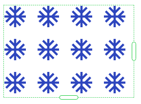
Repeat grid in Adobe XD
Masking is backward in Figma
The concept of masking comes from an old technique used in developing photographs where you control the amount of light being exposed to darkroom photographic paper by holding something above the paper. To create a photo that appears inside a shape such as a circle, you simply expose light through a circle cutout positioned above the darkroom paper so that the only light hitting the paper is the light shining through the circle.
In software, masking typically refers to a technique similar to the oval cutout where you want the photo to appear inside an object or shape. When creating a mask in any Adobe software product, you place a shape on top of the photo or object just as you would in a darkroom. However, in Figma, you place the masking shape behind the photo or object. Since a mask is always smaller than the photo or object it is masking, it is also harder to select and manipulate the mask when it is on a layer behind the photo or object it is masking.
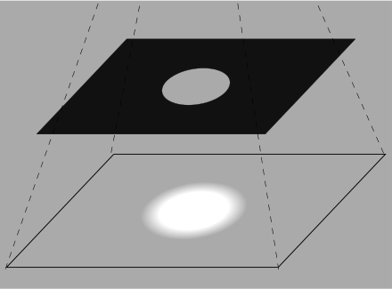
Masking technique used to develop photographs in a darkroom.

Example of image masking layers panel in Figma and Adobe XD
The viewport height line
In Adobe XD, artboards (sort of like Figma’s Frames) display a dotted viewport height line. This is super helpful since it shows where users would have to start scrolling and it also sets the viewport height for the prototype.
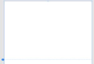
The viewport height line in Adobe XD
Paying once per user
We’ve read a lot of designers concerned that Adobe will remove Figma’s “free” version in the future, but one thing we do like about Adobe is that you just pay once per user. If you share a file with someone else, and they already have a license, you don’t have to pay for their seat (again). With Figma, you must pay for every editor on your files, regardless of whether they have a license. AND it doesn’t even warn you when you add editors.
Remove “selections” from the undo list
Is it me, or does it take a million cmd + Z’s to step back to where you wanted to be? For some reason, Figma’s “undo” action includes undoing an object’s selection, which adds many unnecessary steps to the undos.
Anchor links
UX Team has a standard way to organize our Figma files which includes the use of a “Master” page that our clients use to see all our latest designs. In addition, we use individual “sandbox” pages for each section of the software or website we are designing. Depending on the size of the software or website, the Master page can grow quite large making it hard to locate specific screen designs. An easy way to solve this problem would be to have a menu on the page with anchor links that jump and zoom to specific locations within the page. As with a lot of Figma enhancements, you can find a plugin that provides similar functionality but this seems like a fairly basic feature that should be built into Figma.
Multiple element actions
To help clients and developers understand how an element is supposed to work when interacted with, it helps to see it in action. Sometimes you need to demonstrate multiple interactions on the same element, which isn’t always allowed since one action trumps the other. There are hacky ways to work around this but we’d like to see a more elegant way to allow multiple actions on a given element.
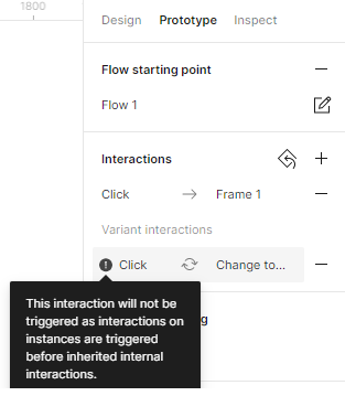
Error message displaying multiple interactions with the same action are not allowed
Sticky on scroll
Another helpful prototype interaction would be setting an element to be sticky to the top of the page. I’m not talking about a header or footer already on the top or bottom of the page, but another element that comes into view as a user scrolls down and then sticks to the top as they scroll further down the content underneath it. The workarounds to “mock” this are glitchy and don’t fully work how you’d want.
Video embed
This one is simple, allowing the embedding of YouTube videos.
Group multiple styles into one
To apply multiple styles to an object, you can do two things. One is to apply each style property one by one. The second is to copy the properties from an existing object and paste them on a new one. If we could group multiple style properties to create a “master” style, it would be much more efficient. A master grouped style would also help maintain consistency throughout a design.
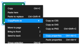
Current method to copy and paste all properties from an object
Wrapping up our Figma wishlist
Figma has always been great about listening to feedback from its users, so we hope our Figma Wishlist 2023 gets fulfilled. We’re looking forward to seeing what is in store for next year!

