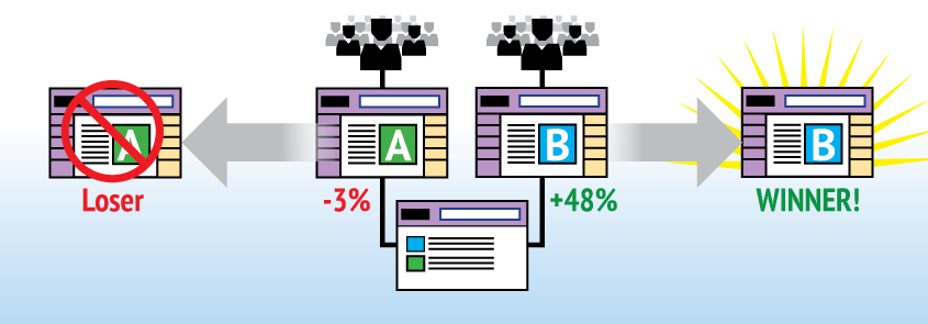

What would a 46% increase in conversion rates mean in terms of additional revenue for your business or funds for your charity? What about a 32% decrease in bounce rates? A 12% increase in Time On Page? An 8% increase in Page Value? A 27% increase in sign-ups?
These are the types of real results that can be achieved through A/B Testing. If you’re not doing it on your website, you’re already losing money.
One of the greatest things about A/B Testing is how it forces design decisions to be made based on proven data and not opinions. In fact, more often than not, people’s opinions about good design or what will increase conversions actually lead to negative results. As User Experience designers, all we really care about is results and implementing a design that proves to be better than another design.
With A/B Testing, opinions are completely removed from the conversation and replaced with a series of hypotheses that are used to test designs as if they were science experiments. Each experiment is run to either prove or disprove a hypothesis, and the tests are monitored against a set of quantifiable success factors until a level of statistical significance is reached and a clear winner is determined. Much the way a scientist would measure the effect of removing or adding a certain compound to an experiment, A/B Testing allows us to test and experiment with small and large changes to a design.

Ex-Googler Dan Siroker founded Optimizely after he did extensive work for the Obama campaign website. In a presentation, he spoke about the power of A/B tests and how small, seemingly insignificant text and image changes greatly impacted the number of sign-ups and campaign donations.
| Cookie | Duration | Description |
|---|---|---|
| cookielawinfo-checkbox-analytics | 11 months | This cookie is set by GDPR Cookie Consent plugin. The cookie is used to store the user consent for the cookies in the category "Analytics". |
| cookielawinfo-checkbox-functional | 11 months | The cookie is set by GDPR cookie consent to record the user consent for the cookies in the category "Functional". |
| cookielawinfo-checkbox-necessary | 11 months | This cookie is set by GDPR Cookie Consent plugin. The cookies is used to store the user consent for the cookies in the category "Necessary". |
| cookielawinfo-checkbox-others | 11 months | This cookie is set by GDPR Cookie Consent plugin. The cookie is used to store the user consent for the cookies in the category "Other. |
| cookielawinfo-checkbox-performance | 11 months | This cookie is set by GDPR Cookie Consent plugin. The cookie is used to store the user consent for the cookies in the category "Performance". |
| viewed_cookie_policy | 11 months | The cookie is set by the GDPR Cookie Consent plugin and is used to store whether or not user has consented to the use of cookies. It does not store any personal data. |