Design systems unify styles, reusable components, interactions, usage guidelines, and documentation into a centralized source. By defining all elements in a design system, designers and developers can create, build, and maintain consistent, cohesive, and scalable products.
Must-have design elements
A successful design system includes core elements for styles, components, and interactions, working together to create a cohesive and user-friendly experience. Defining key elements like colors, typography, layout, imagery, reusable components, and interaction guidelines ensures consistency, efficiency, and accessibility across the product.
Styles
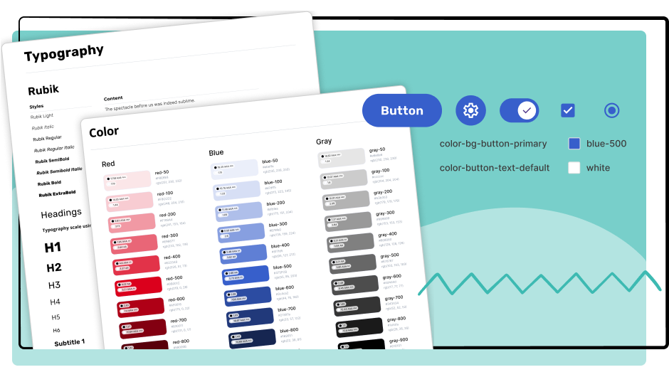
Styles serve as the core properties throughout the system, maintaining a consistent design. Typically, designers divide styles into main categories, including color palettes, typography, layout, and imagery. However, additional categories and definitions may be needed depending on the project’s size.
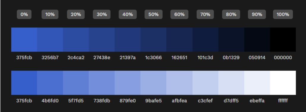
Colors Define and categorize color styles into primary, secondary, accent/tertiary, semantic, and data visualization groups. Ensure accessibility and usability for all users by defining light and dark mode alternatives for each color. If a color is used in text or icons, make sure it meets the WCAG AA contrast ratio guidelines.
Using a tint and shade scale for a color family is helpful when defining colors for modes and interactive elements like button states to maintain visual consistency.
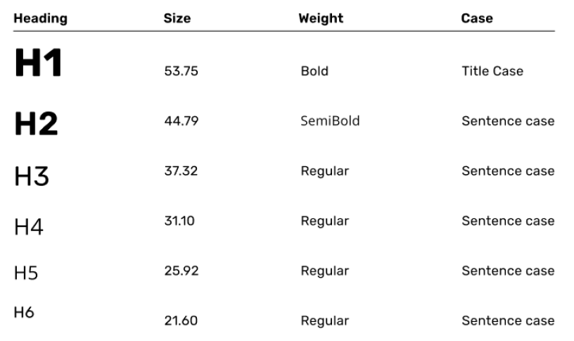
Typography Typography styles should define the font family, size, weight, and letter and paragraph spacing for headings, body text, buttons, and other text elements. Designers should also consider using a well-defined type scale to make the interface responsive across different-sized devices.
Establishing a responsive type scale is crucial for consistent visual hierarchy and readability.
Layout Establish the grid system you’ll use as the base building block for the layout. Additional elements to define include breakpoints for responsive design, spacing, elevation, border styles, and corner radius.
Imagery Design teams should define guidelines for iconography, image style, and logos in the images section. While branding guidelines often describe these elements, the team should include them in the design system to maintain brand integrity.
Iconography style definition and guidelines example
Icon Library: Font Awesome classic rounded icons, thin stroke
Guidelines: When selecting an icon, ensure it is simple, relevant, and recognizable.
Components
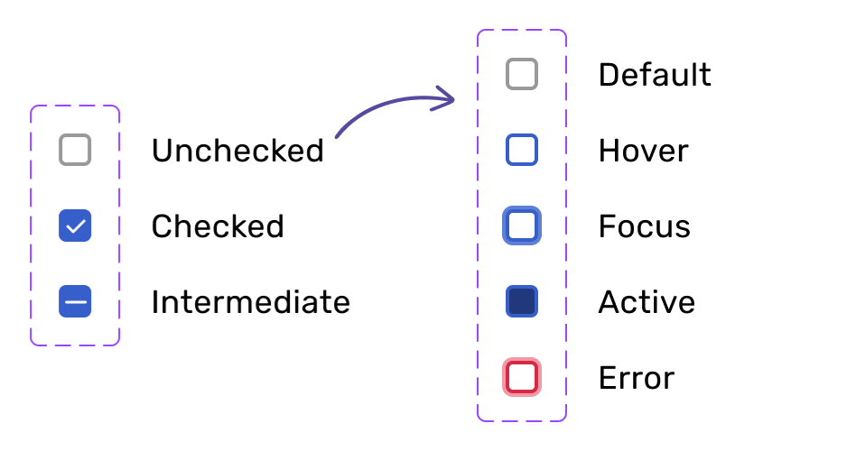
Components are any reusable element used throughout the application or website. Each component should include variants, states, and usage guidelines.
Checkbox component with variants and different states defined for the unchecked variant.
Interactions
Interactions should define guidelines for how the interface responds when users engage with it. This includes feedback through animations, transitions, sound, and haptics. Define timing, duration, and easing for all animations and transitions to provide a consistent user experience. For example, when the user clicks a button, switch to the ‘active’ variant with a linear, 150ms animation.
Quick tip Providing prototypes demonstrates how interactive elements are intended to look and behave.
Design system documentation
Clear usage guidelines and detailed spec documentation play a key role in creating a successful design system. Guidelines explain how to use styles, components, and interactions, while spec documentation offers precise measurements and behaviors, helping developers implement designs accurately and efficiently.
Usage guidelines
Usage guidelines provide clear, detailed, and actionable instructions for all items defined in the design system, including styles, components, and interactions. These guidelines should cover when, where, and how to use an item, along with best practices and accessibility considerations. Thorough guidelines ensure designers and developers use items correctly and consistently throughout the design and development process.
Tooltip usage guidelines example
Tooltips appear as an overlay once a user gives it focus and should stay visible until the user moves their mouse or moves the focus on other elements on the screen.
Keep tooltip short and concise
Use to additional information to a user to help them understand the meaning or purpose of an element.
Information essential to completing an action should always be displayed to users and not hidden in a tooltip
Spec documentation
Spec documentation provides detailed specifications for measurements, spacing, colors, behaviors, and more. You can supply documentation with CSS, design tokens, and flow diagrams. Including even the smallest details ensures every element is implemented accurately and consistently and streamlines the development process. As a bonus, developers will be happy you removed the guesswork!
Design system resources
Looking for inspiration? Explore these external links to our favorite design systems from industry-leading companies.

