An industry leader in power conversion technology.
Our client’s products are mainly used to convert and control power in critical 9-1-1 cell towers and massive data centers. Therefore, system failures are simply not an option. The product’s interface must allow users to proactively monitor and address potential issues before they arise. Then, when the inevitable issues do happen, users must be able to quickly fix the issues to avoid any downtime.
UX Team was hired to design the web, mobile, and hardware panel interfaces for its Next-Generation Power Converters.
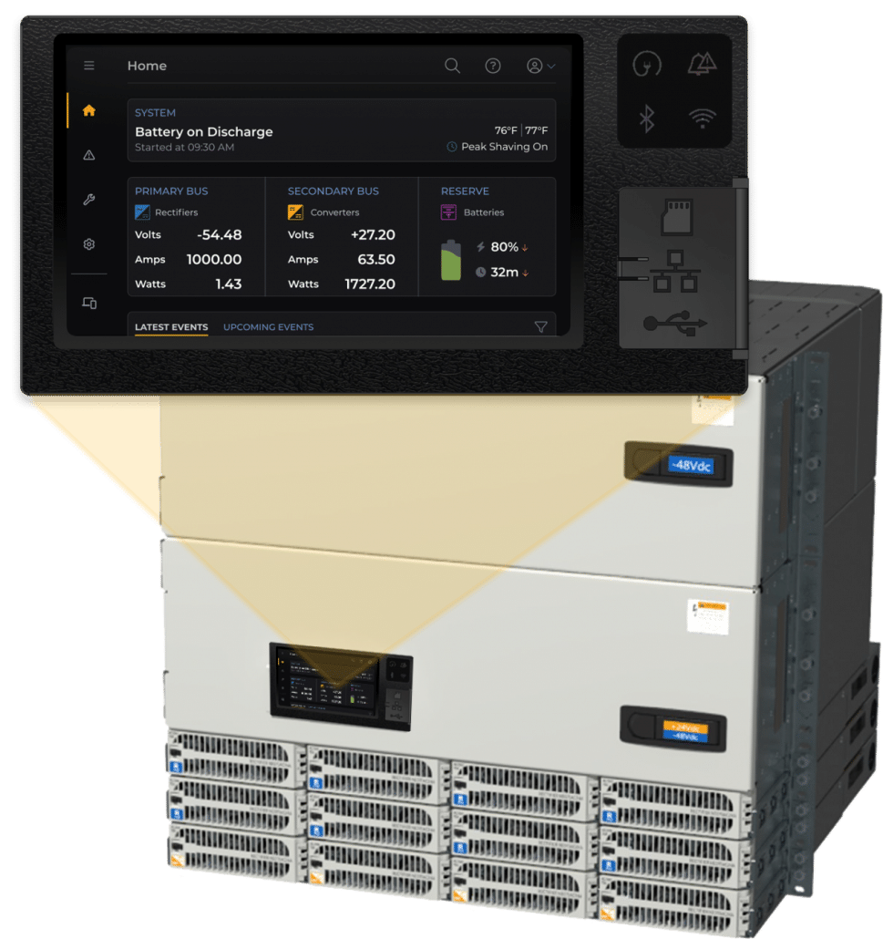
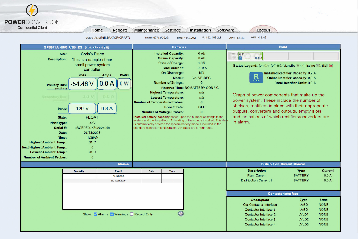
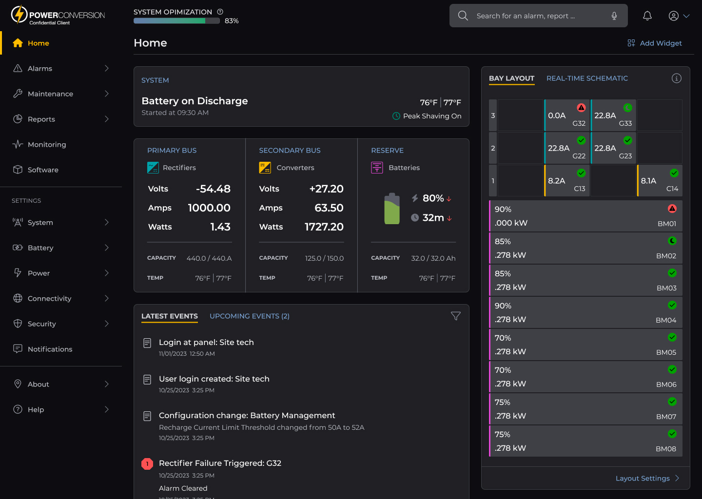
Modernize the navigation menu and introduce multiple intuitive avenues for finding information.
Ensure the product feels and works the same way, whether accessed via the panel, web or mobile interface.
The product is often used in emergency situations by techs who are not familiar with the device, or even the subject matter. Therefore, it’s important for troubleshooting to be extremely simple and straightforward.
The user demographic is primarily men 50 and older who:
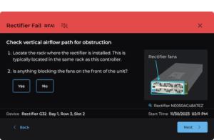
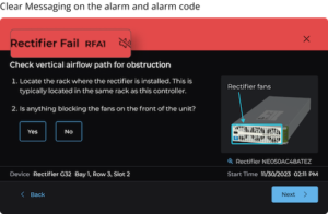
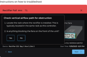
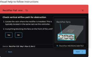
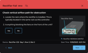
Most users we interviewed talked about how confusing the alarm messages were. They were often cryptic, misleading, and inaccurate, making it very difficult to resolve any issues.
Our new alarm messaging is designed to be understood by even the most inexperienced technician. In addition, we designed an easy-to-follow troubleshooting wizard to help users quickly resolve issues on their own without contacting Tech Support.
The information architecture for this product is multifold. We conducted a card sort and a treejack study to understand users’ mental models and how they group features and functions. We also explored journeys and task flows for each user. The design incorporates reusable components that are dropped into screens that different users access. Our philosophy for the content structure for this project is “Group related content together.”


Efficiency Through Purposeful Navigation
By consolidating options and grouping similar functions, we’ve significantly improved navigation ease. The introduction of comprehensive overview screens has empowered users with a clearer understanding of system functionalities.
Think about the necessities of your group market
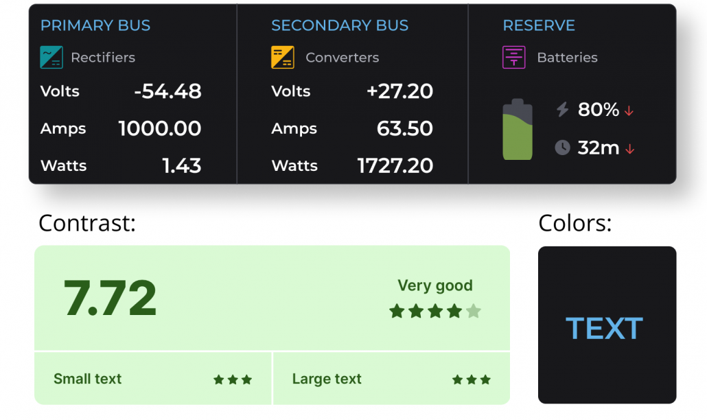
By prioritizing accessibility, we created more intuitive, clearer, and accommodating interfaces, ensuring that all users, regardless of age or visual differences, can engage with ease and confidence.
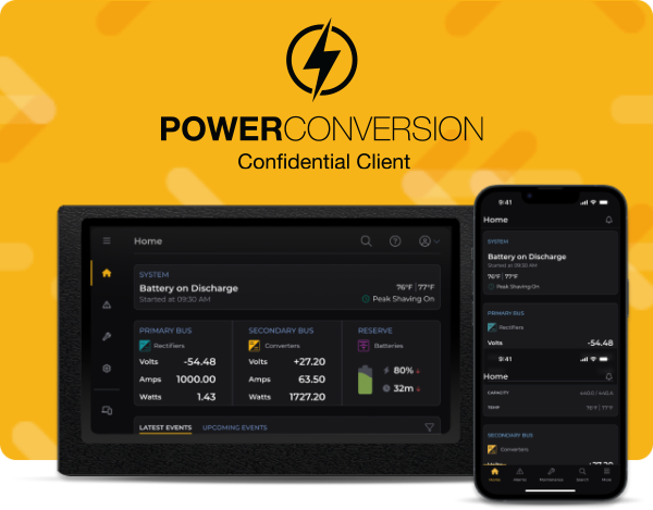
Power system front panel controller, web interface and mobile app for OmniOn Read More
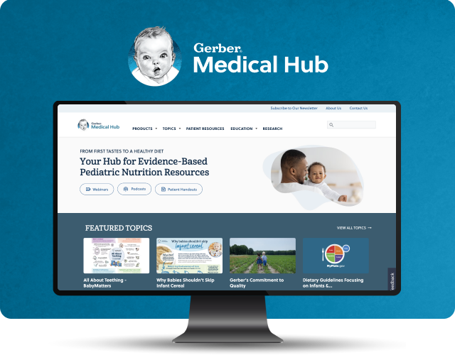
A valuable online resource that provides evidence-based pediatric nutritional information for healthcare Read More
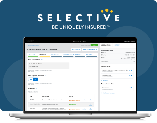
Tool for documenting rationale behind insurance underwriting decisions.
| Cookie | Duration | Description |
|---|---|---|
| cookielawinfo-checkbox-analytics | 11 months | This cookie is set by GDPR Cookie Consent plugin. The cookie is used to store the user consent for the cookies in the category "Analytics". |
| cookielawinfo-checkbox-functional | 11 months | The cookie is set by GDPR cookie consent to record the user consent for the cookies in the category "Functional". |
| cookielawinfo-checkbox-necessary | 11 months | This cookie is set by GDPR Cookie Consent plugin. The cookies is used to store the user consent for the cookies in the category "Necessary". |
| cookielawinfo-checkbox-others | 11 months | This cookie is set by GDPR Cookie Consent plugin. The cookie is used to store the user consent for the cookies in the category "Other. |
| cookielawinfo-checkbox-performance | 11 months | This cookie is set by GDPR Cookie Consent plugin. The cookie is used to store the user consent for the cookies in the category "Performance". |
| viewed_cookie_policy | 11 months | The cookie is set by the GDPR Cookie Consent plugin and is used to store whether or not user has consented to the use of cookies. It does not store any personal data. |