
Quoting system for insurance agents
Selective Insurance Company of America provides insurance products and services to businesses, public entities and individuals through independent agents in 27 Eastern, Southern, Midwestern, and Southwestern states and the District of Columbia.
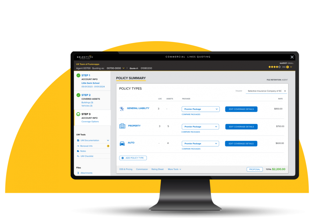
UX Team was hired to redesign User Experience of Selective’s Insurance Policy Quoting and Issuance application, which involved extensive user interviews and shadowing, prototyping, usability testing, and Angular development.
50% of agents surveyed reported that the most important factor when considering an insurance carrier to use is speed to quote. The remaining 50% listed speed to quote as the second most important factor.
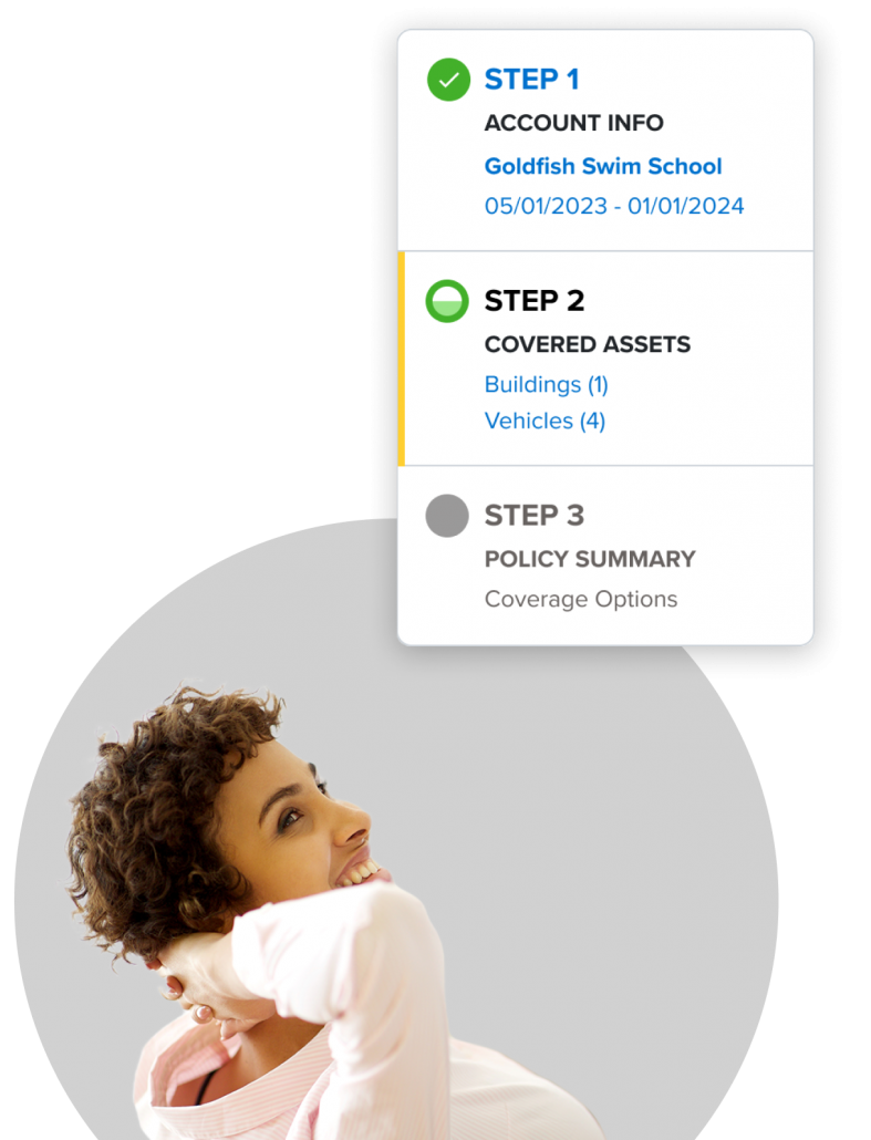
Because of the product roadmap, the new UI would only be pushed out to quotes that meet specific criteria. It is important to determine whether that criterion is met as early as possible so users don’t have to re-do work if the policy is not eligible.
Selective was losing business to competitors in part because their competitors’ quoting application was simply faster and easier to use.
We sought to get a deep understanding of:
UX Team conducted the following activities:
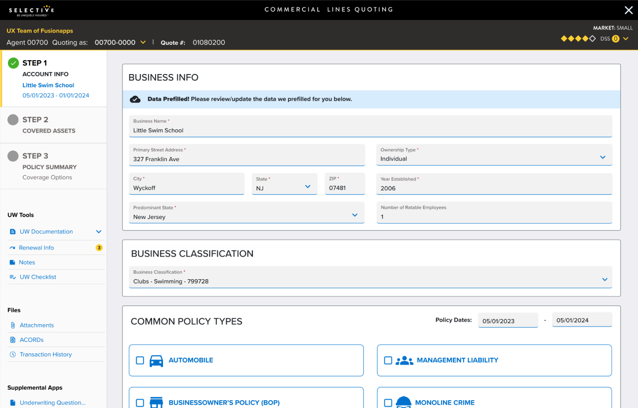
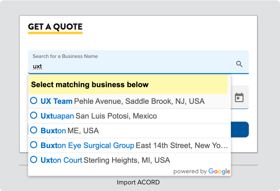
The new design features an auto-complete as well as a browsable interface to help agents find the correct class code.
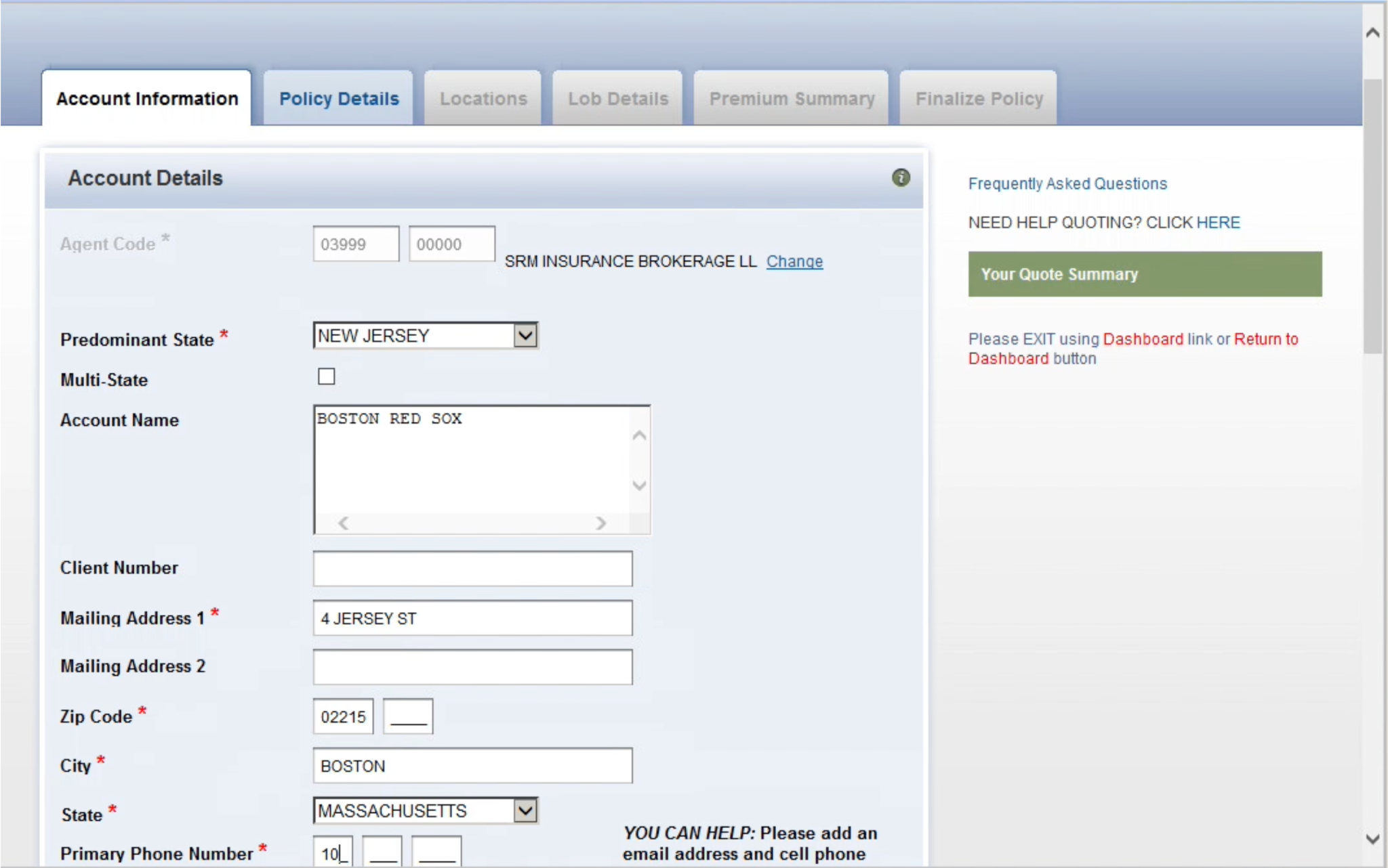
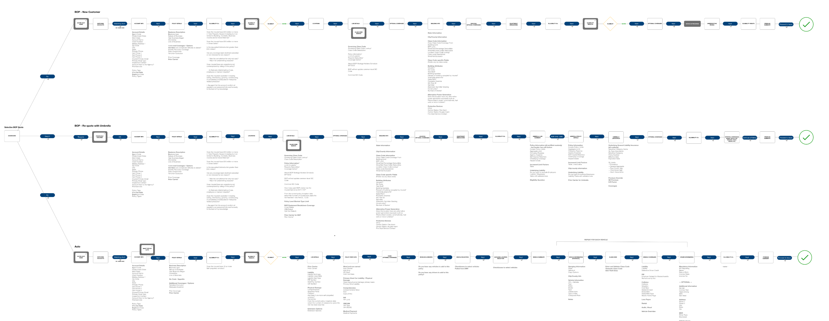
UX Team audited the existing quote flow and proposed fields that could be eliminated, content that could be prefilled and steps that could be consolidated to make the quoting process faster and easier for agents.
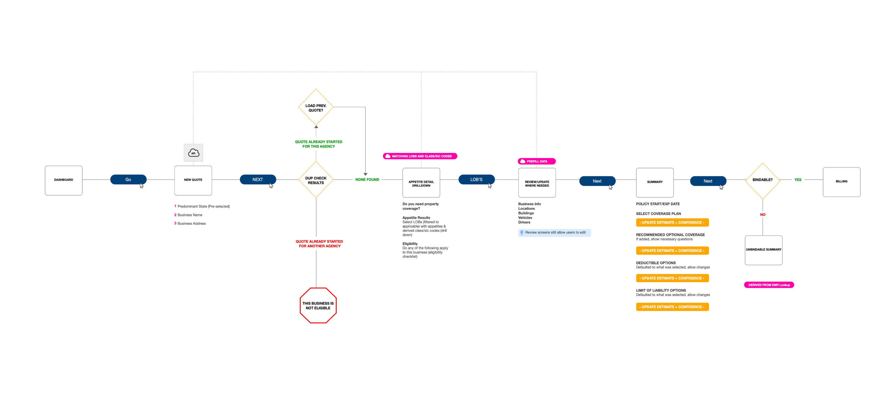
The new streamlined user experience switches the user’s focus from heavy, redundant data entry to “review and edit as needed”. Most of the information is automatically populated for them based on the insured’s business name and address. In many cases, the agent just has to select the policy types and the automated pre-fills and the recommendation engine do the rest.
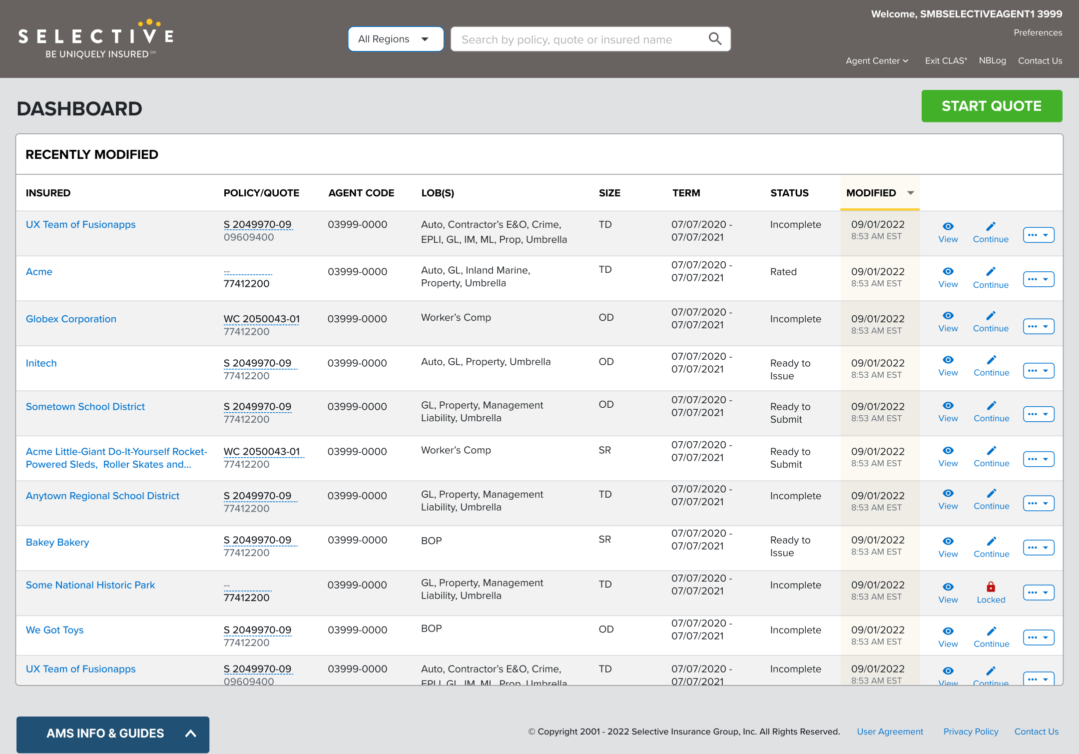
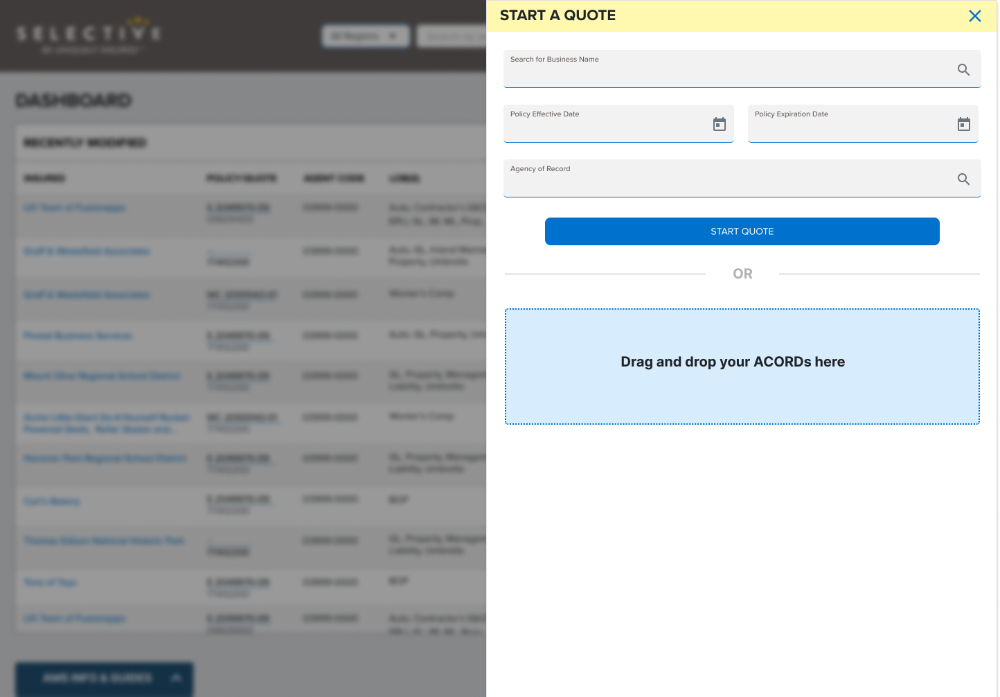
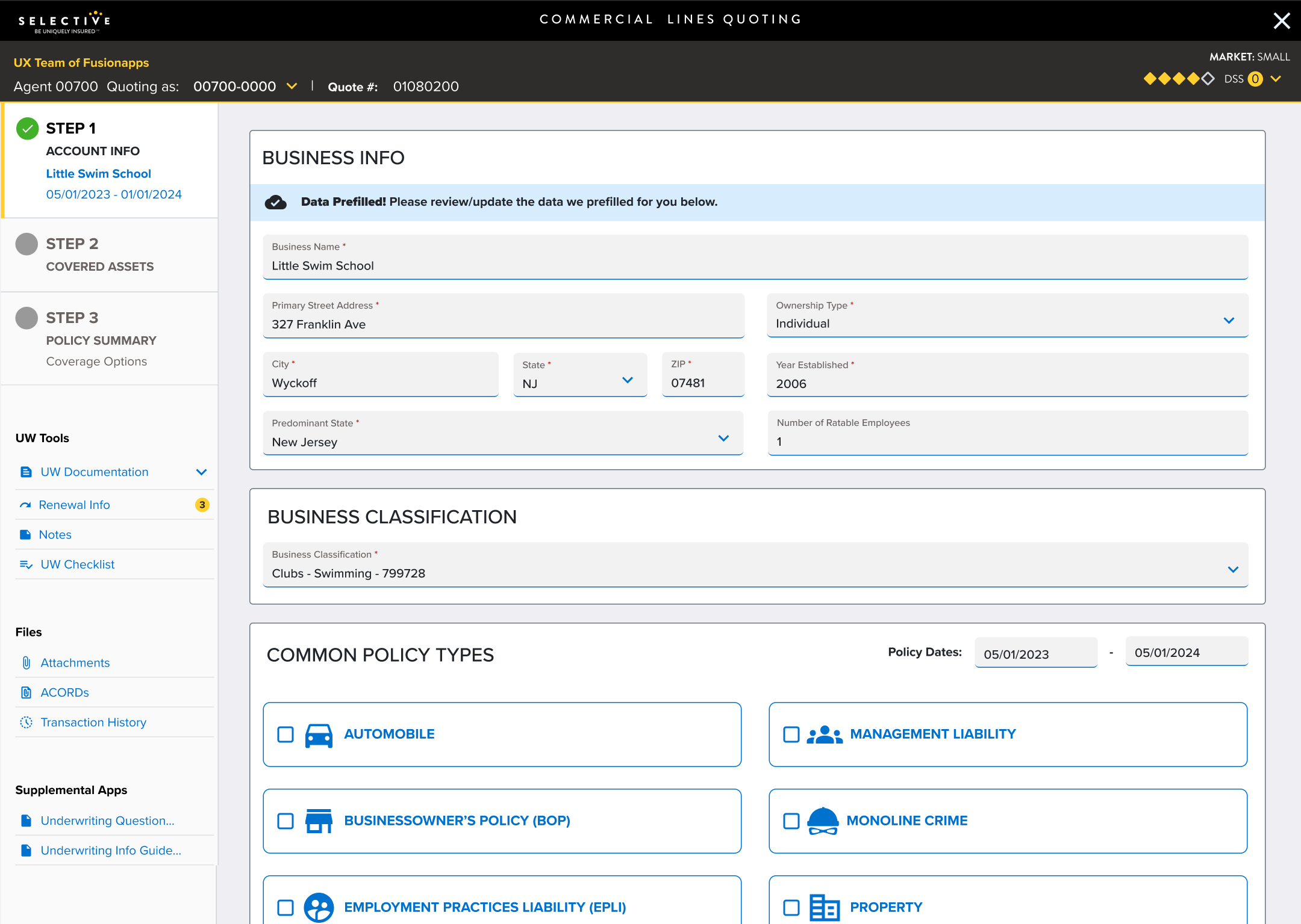
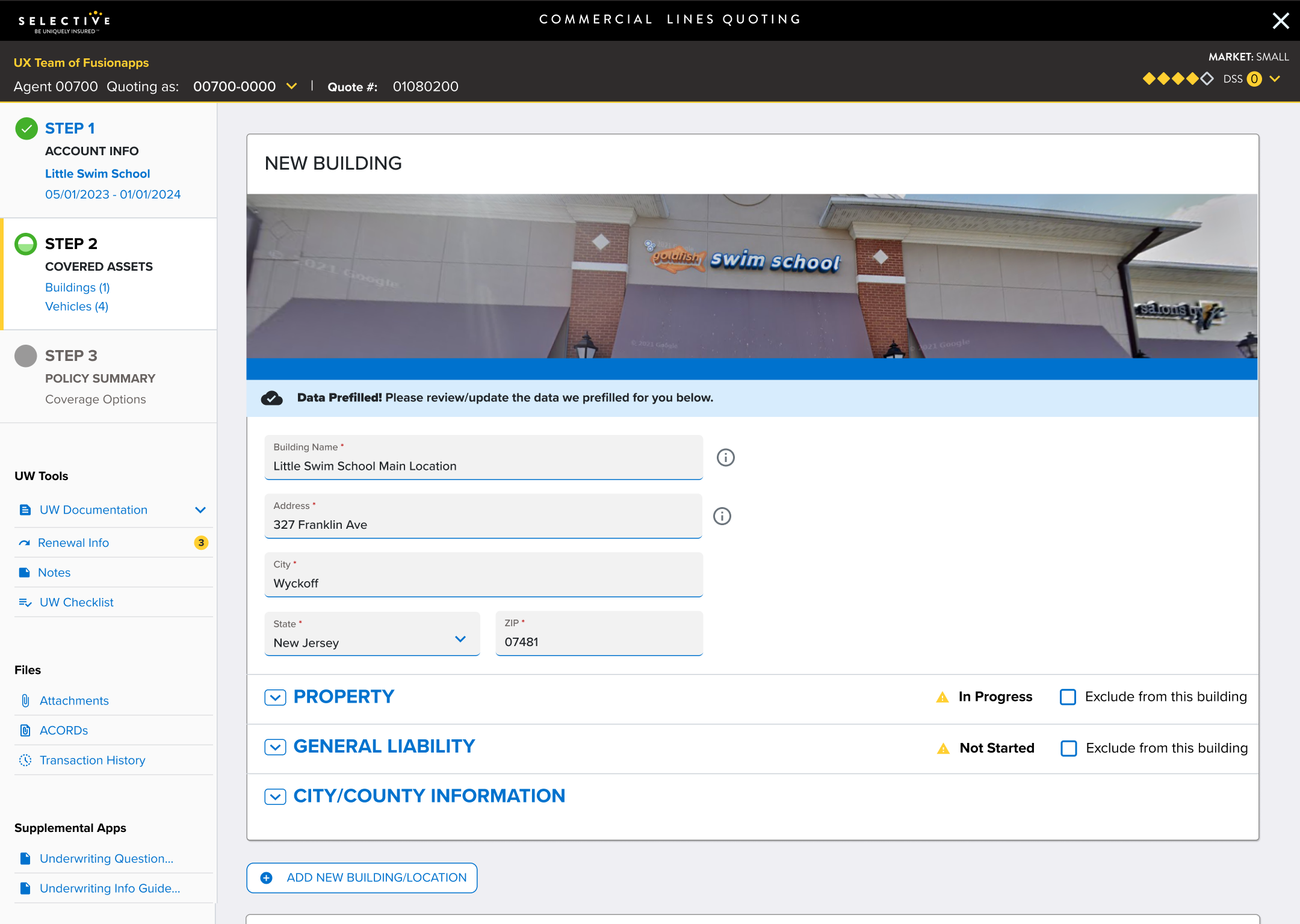
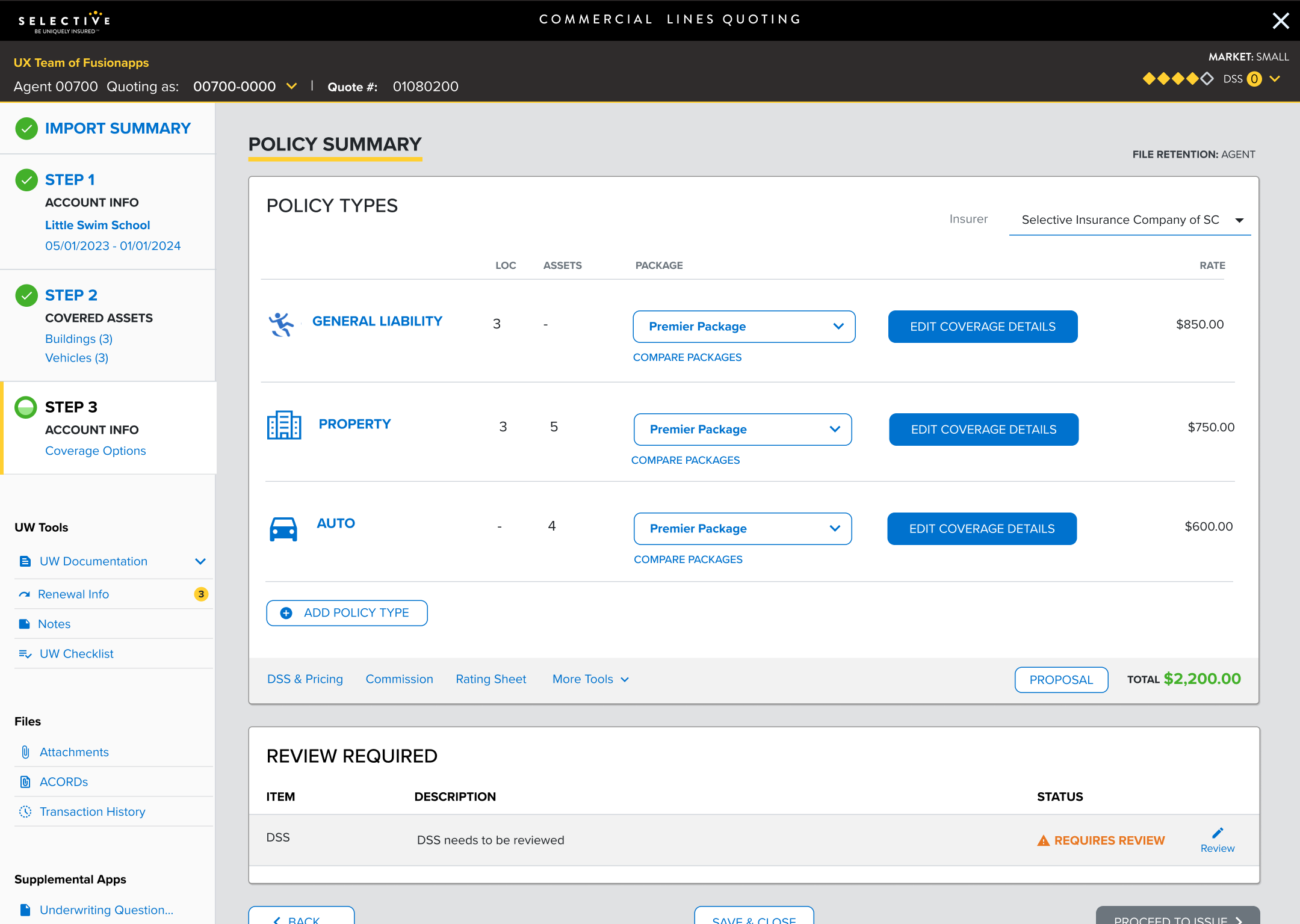
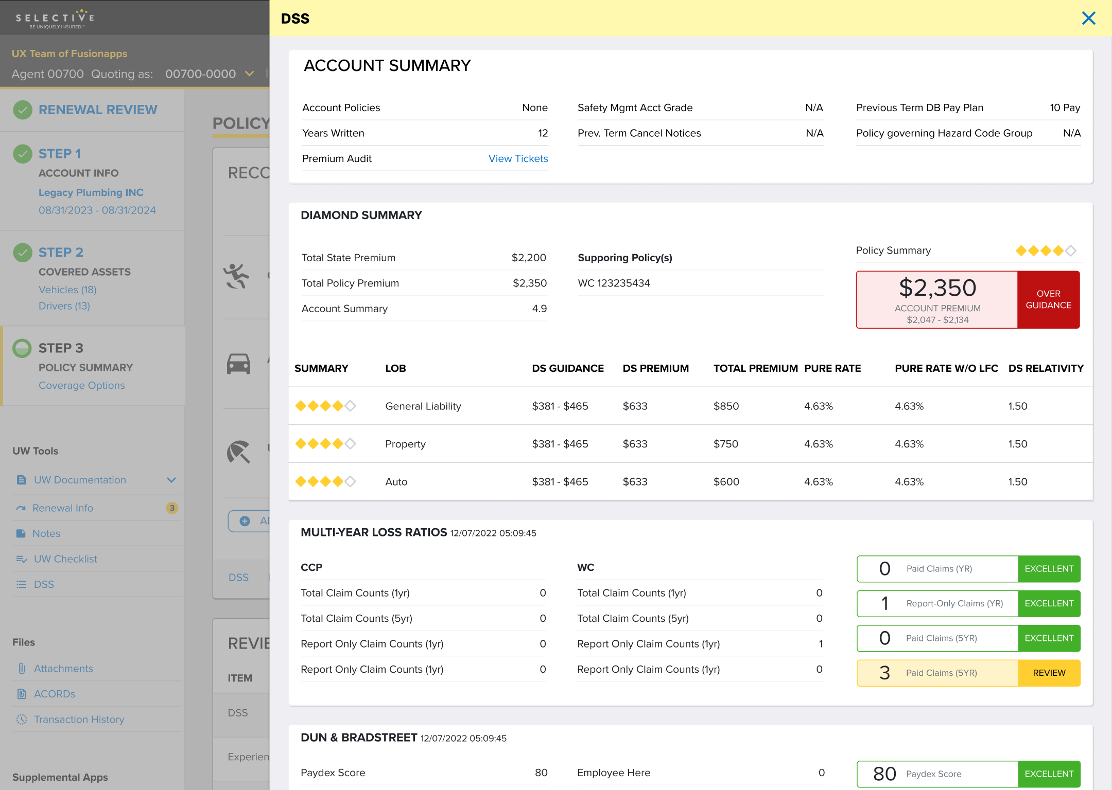
We converted the mockups into a high-fidelity Angular prototype. We used the prototype for usability testing and passed it along to Selective’s development team as dev-ready assets.

UX Team continues to work with Selective as the application moves through the roadmap. We provide support, advice on UX for new business needs and features and mockups as needed.
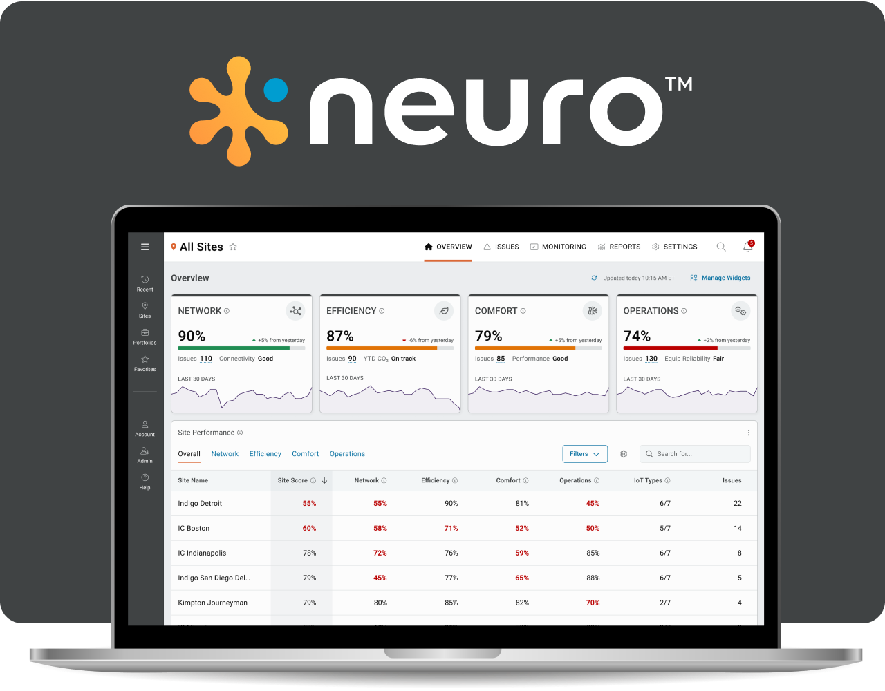
Building Management System (BMS) with IoT integration

Power system front panel controller, web interface, and mobile app for a Read More
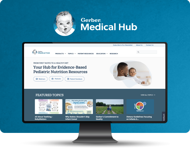
A valuable online resource that provides evidence-based pediatric nutritional information for healthcare Read More
| Cookie | Duration | Description |
|---|---|---|
| cookielawinfo-checkbox-analytics | 11 months | This cookie is set by GDPR Cookie Consent plugin. The cookie is used to store the user consent for the cookies in the category "Analytics". |
| cookielawinfo-checkbox-functional | 11 months | The cookie is set by GDPR cookie consent to record the user consent for the cookies in the category "Functional". |
| cookielawinfo-checkbox-necessary | 11 months | This cookie is set by GDPR Cookie Consent plugin. The cookies is used to store the user consent for the cookies in the category "Necessary". |
| cookielawinfo-checkbox-others | 11 months | This cookie is set by GDPR Cookie Consent plugin. The cookie is used to store the user consent for the cookies in the category "Other. |
| cookielawinfo-checkbox-performance | 11 months | This cookie is set by GDPR Cookie Consent plugin. The cookie is used to store the user consent for the cookies in the category "Performance". |
| viewed_cookie_policy | 11 months | The cookie is set by the GDPR Cookie Consent plugin and is used to store whether or not user has consented to the use of cookies. It does not store any personal data. |