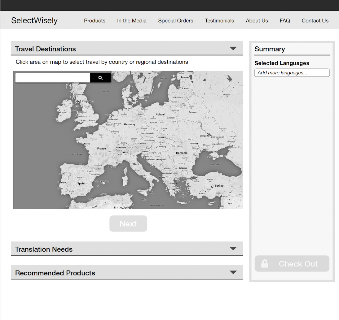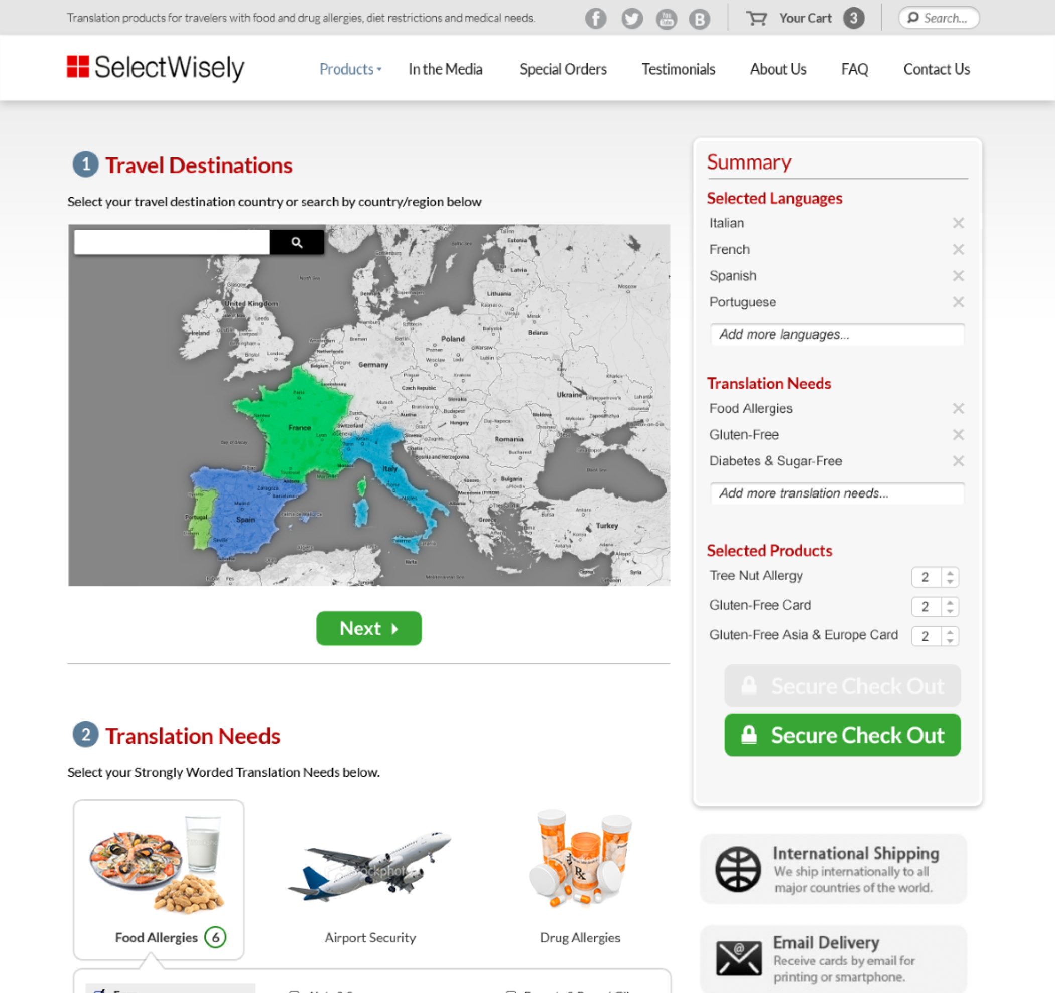
SelectWisely sells customized translation and food allergy products for travelers.

We created their new e-commerce website with a mobile-friendly, responsive design using the Bootstrap framework and a custom-developed shopping cart. We also redesigned and recategorized the SelectWisely product lines to make it easier for users to shop and purchase products.
In addition, we re-positioned the SelectWisely brand by elevating its key competitive differentiators and making it known for providing clear, accurate translations on durable, travel-size cards.
SelectWisely continues to work with UX Team to add new features to its website, create marketing assets, and even redesign all of its translation cards.


We converted the mockups into a code based HTML-CSS web-app.

The revamped e-commerce site for SelectWisely elevates user experience and brand positioning. With improved navigation and emphasis on clear translations, it enhances accessibility and communicates the brand’s unique value. Ongoing efforts will strengthen its position as a top provider of travel translation solutions.

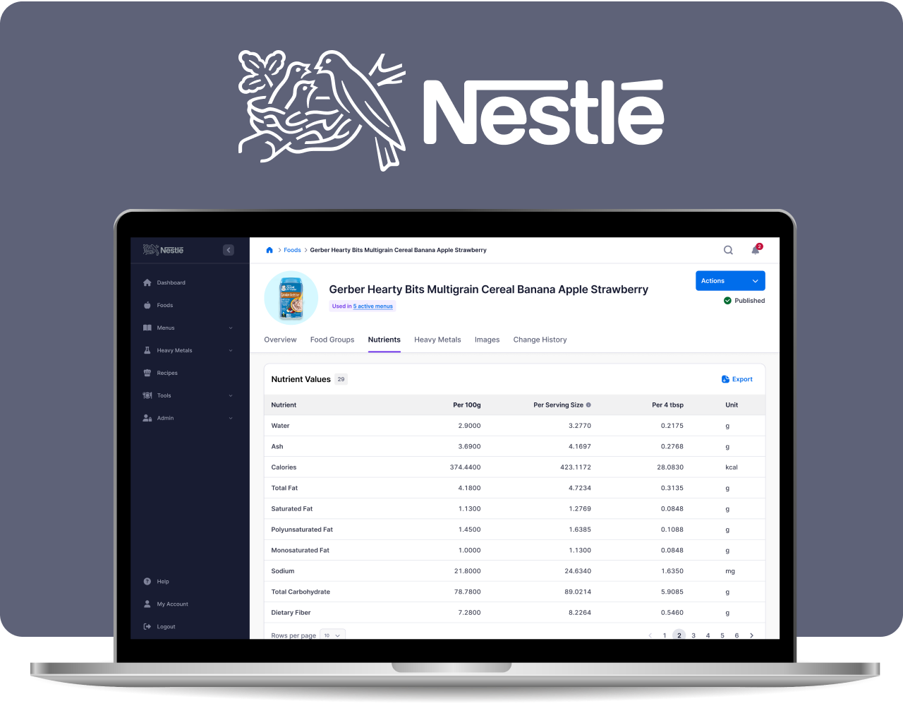
Centralized nutrition data management system with API

Streamlining the job application process for healthcare workers

A valuable online resource that provides evidence-based pediatric nutritional information for healthcare Read More
| Cookie | Duration | Description |
|---|---|---|
| cookielawinfo-checkbox-analytics | 11 months | This cookie is set by GDPR Cookie Consent plugin. The cookie is used to store the user consent for the cookies in the category "Analytics". |
| cookielawinfo-checkbox-functional | 11 months | The cookie is set by GDPR cookie consent to record the user consent for the cookies in the category "Functional". |
| cookielawinfo-checkbox-necessary | 11 months | This cookie is set by GDPR Cookie Consent plugin. The cookies is used to store the user consent for the cookies in the category "Necessary". |
| cookielawinfo-checkbox-others | 11 months | This cookie is set by GDPR Cookie Consent plugin. The cookie is used to store the user consent for the cookies in the category "Other. |
| cookielawinfo-checkbox-performance | 11 months | This cookie is set by GDPR Cookie Consent plugin. The cookie is used to store the user consent for the cookies in the category "Performance". |
| viewed_cookie_policy | 11 months | The cookie is set by the GDPR Cookie Consent plugin and is used to store whether or not user has consented to the use of cookies. It does not store any personal data. |