
A web application’s design and usability are just as important as that application’s functionality. If our clients, their users, their partners, and their vendors can’t immediately figure out how to use a web application, then we haven’t done our job correctly.
A lot of developers have trouble admitting that, at the end of the day, most users don’t want to see “the man behind the curtain”. In a recent post for Smashing Magazine (“Designing User Interfaces For Business Web Applications“), blogger Janko Jovanovic writes:
“…for users, the user interface IS the product – they don’t care about fantastic back ends or powerful servers. All they want to see is the user interface.”
Jovanovic does a great job of describing the process, techniques, and principles of designing a web application. He identifies some key points:
Understanding the client’s business is always the first priority. Who are the client’s primary customers? Will the primary customers, in fact, be the users? Clients sometimes forget that users may also include partners, vendors, and other third parties.
Who’s REALLY using the application? Through analytics and testing, we discover the true users. What are the most popular keywords? What types of browsers do the users have? Where is the user located? Which features are they using the most? All this information helps us make better decisions about the changes we make to the interface and, ultimately, the user experience.
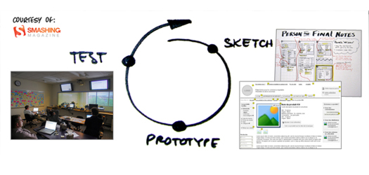
We do follow a design process, but we alter the process to meet the client’s needs. Once we have identified needs, we implement UX design principles that involve creating prototypes that can be quickly put into the hands of users before we actually build the application. Through wireframing, sketching, or making a full-blow design, we establish how the interface will look. For content-driven sites, we employ these and other UX design principles, such as card sorting, to better understand how the user sees and organizes the content.
To maintain consistency throughout the user interface, we involve our designers in every addition and adjustment that occurs during the development process. For a more mature web application, we create a style guide to ensure consistency throughout the design.
Trends in interface design may come and go, but what is popular isn’t always necessarily best for the end user. If we’re updating or redesigning a user interface, we acknowledge that the user is accustomed to certain standards. We wouldn’t want to change an interface so drastically that the user no longer understands how to navigate it.
Ultimately, we seek whatever will make the web application more efficient and easy to use. If a feature isn’t useful for the end user, then it’s unnecessary.
| Cookie | Duration | Description |
|---|---|---|
| cookielawinfo-checkbox-analytics | 11 months | This cookie is set by GDPR Cookie Consent plugin. The cookie is used to store the user consent for the cookies in the category "Analytics". |
| cookielawinfo-checkbox-functional | 11 months | The cookie is set by GDPR cookie consent to record the user consent for the cookies in the category "Functional". |
| cookielawinfo-checkbox-necessary | 11 months | This cookie is set by GDPR Cookie Consent plugin. The cookies is used to store the user consent for the cookies in the category "Necessary". |
| cookielawinfo-checkbox-others | 11 months | This cookie is set by GDPR Cookie Consent plugin. The cookie is used to store the user consent for the cookies in the category "Other. |
| cookielawinfo-checkbox-performance | 11 months | This cookie is set by GDPR Cookie Consent plugin. The cookie is used to store the user consent for the cookies in the category "Performance". |
| viewed_cookie_policy | 11 months | The cookie is set by the GDPR Cookie Consent plugin and is used to store whether or not user has consented to the use of cookies. It does not store any personal data. |