

In this list, we explore the Top 10 Ways to Scare a UX Designer. From the horrors of Comic Sans to the terror of tiny clickable targets, these scenarios are every designer’s worst nightmare and will send shivers down the spine of any UX professional.
Ah, the bane of every designer’s existence. The mere sight of Comic Sans on a professional interface is enough to make any UX designer’s skin crawl. Why use readable, professional fonts when you can use this?
Bonus points if you throw in some Papyrus for that “ancient, mysterious” vibe—because nothing says “I care about design” like a font that looks like it belongs on a cheap sci-fi movie poster. Just imagine the horror of pairing these two fonts together—an absolute typography nightmare!
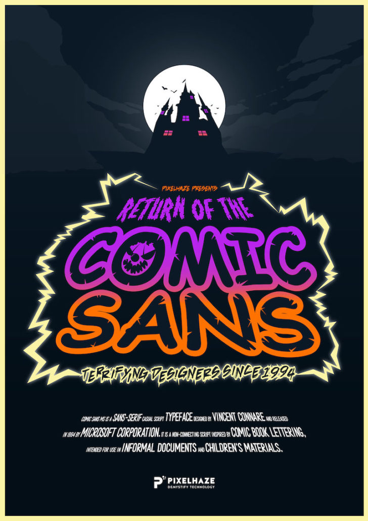
We couldn’t help but mention the hilarious (and slightly terrifying) resurgence of Comic Sans, as highlighted in the Pixel Haze Academy blog post, “Return of the Comic Sans.”
Nothing terrifies a designer more than seeing neon green paired with hot pink and mustard yellow. It’s like watching a color crime in progress. The more eyestrain, the better! You could even add flashing colors, just in case they weren’t scared enough. Just take a look at our title, painful to the eyes.

Make every button smaller than a postage stamp. Who needs accessible, tappable areas when users can sharpen their precision skills?

Imagine a world where pop-ups open *another pop-up*, and then another one for good measure. Bonus points if they cover up the entire screen and the ‘close’ button is impossible to find. Make sure the final pop-up asks if they want to sign up for a newsletter. They’ll love it.

Design an endless carousel of images that users have to scroll through, without any arrows to indicate that it will never, ever end. UX nightmare fuel. Or how about a website that swipes horizontally instead of vertically.
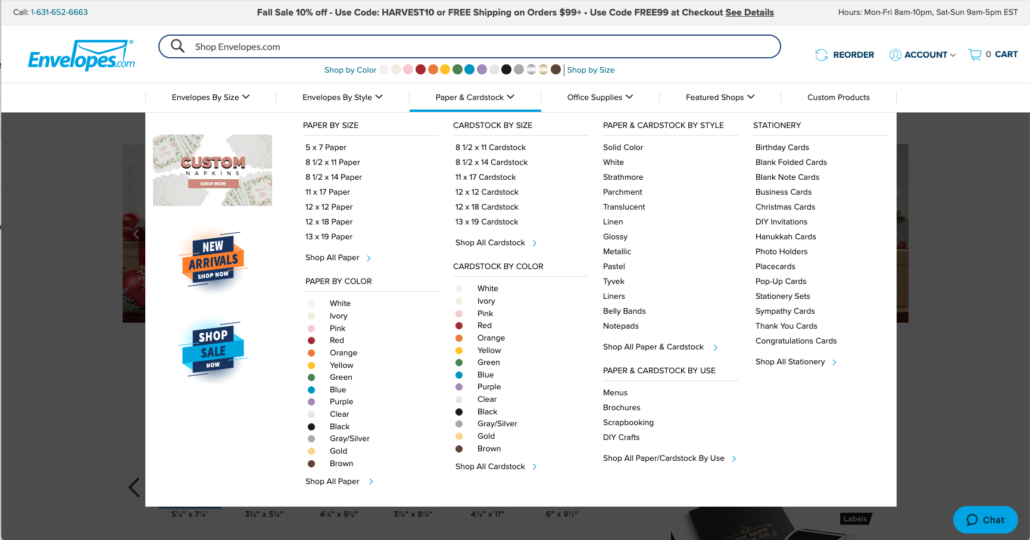
Create a menu with 20+ items, all on the same level. No categorization, no organization—just chaos. Now, let’s see them find anything!
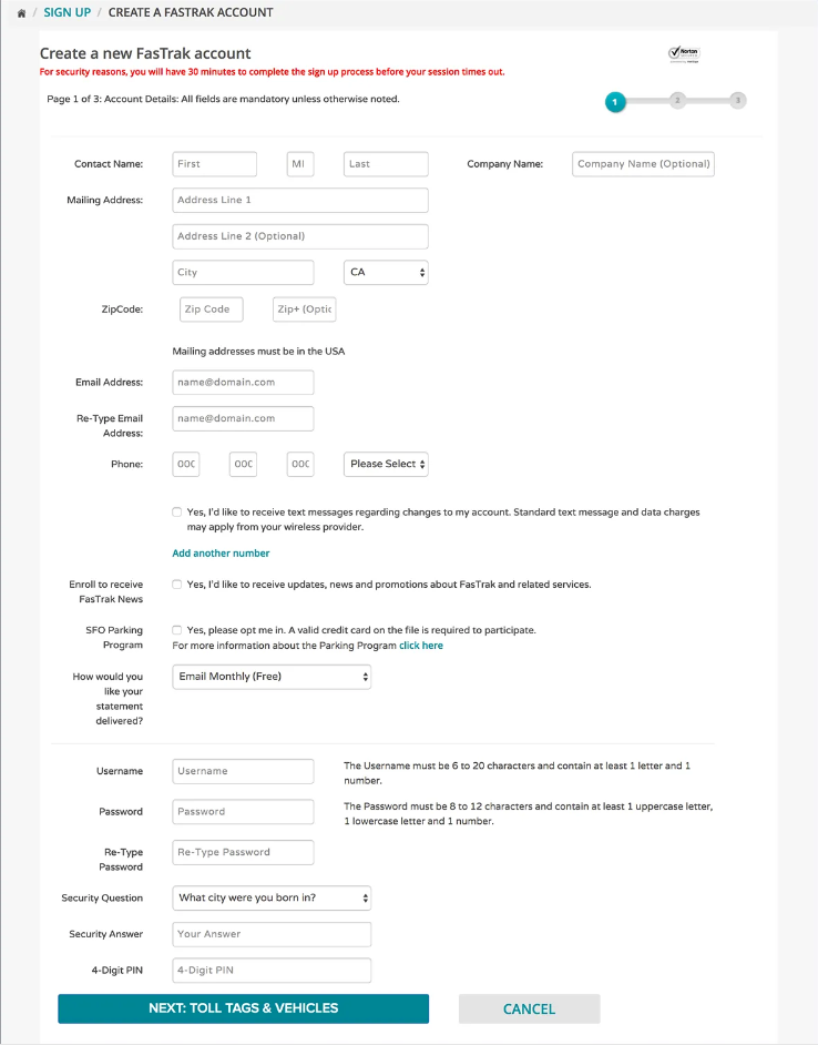
“Why ask for just the essentials when you can make them fill out their entire life story?” Make the forms *so* long that users give up halfway through. Make sure there’s no progress bar!
Set up navigation that’s as clear as a foggy night. Hide important buttons in corners, or bury crucial actions under obscure labels like “Surprises.”
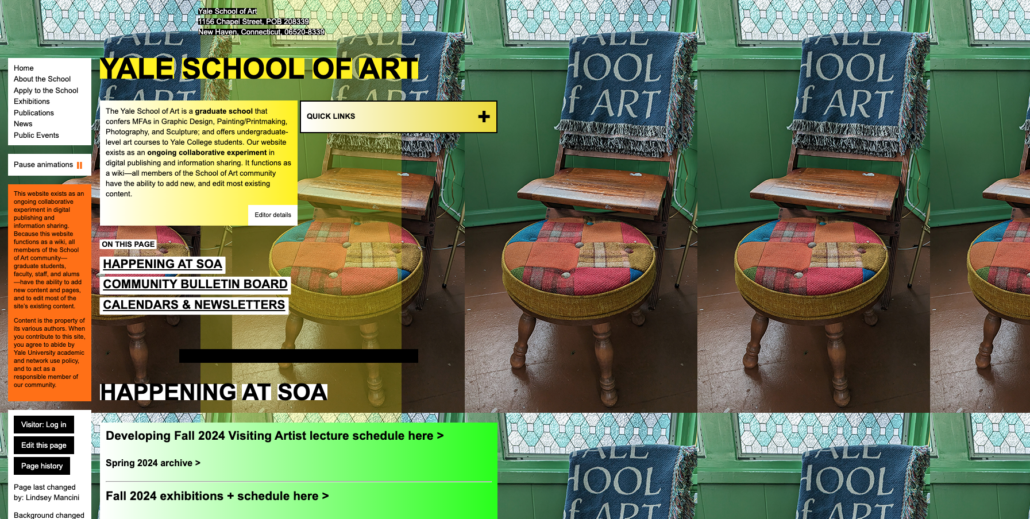
Source: https://www.art.yale.edu/
Throw in at least five different fonts, preferably in various sizes and weights, on a single screen. If the user’s eye isn’t bouncing around like a pinball, you’re not doing it right!
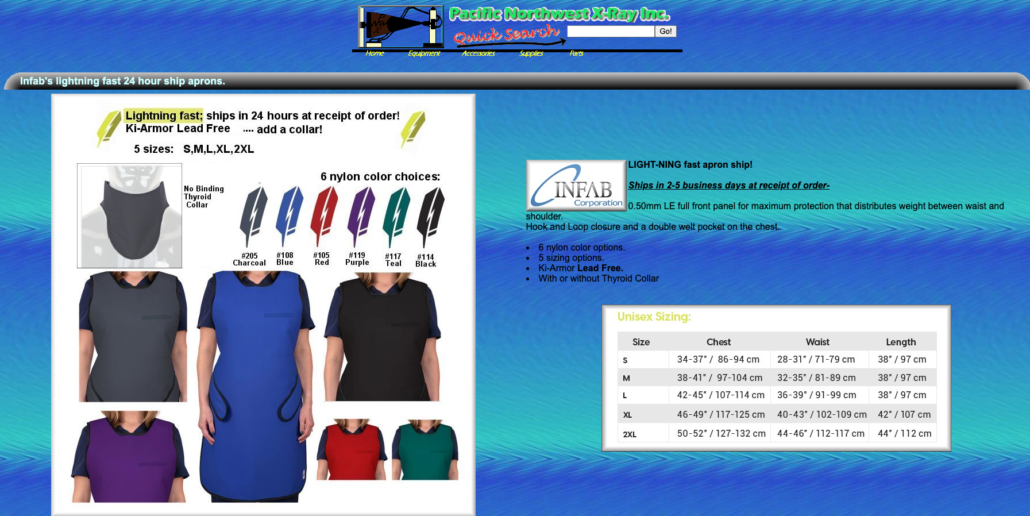
Source https://www.pnwx.com/
Nothing scares a modern UX designer more than realizing the beautiful desktop version they designed is a *disaster* on mobile. Buttons are cut off, images overlap text—it’s the stuff of digital horror stories.


Source https://www.nhc.noaa.gov/
While these funny examples exaggerate bad design practices, they serve as a reminder of the importance of good UX. A seamless, user-friendly experience requires thoughtful design decisions that balance functionality, aesthetics, and accessibility. So, the next time you open a project, remember to spare your fellow UX designers from these nightmares—because good design isn’t just nice to have, it’s essential!
| Cookie | Duration | Description |
|---|---|---|
| cookielawinfo-checkbox-analytics | 11 months | This cookie is set by GDPR Cookie Consent plugin. The cookie is used to store the user consent for the cookies in the category "Analytics". |
| cookielawinfo-checkbox-functional | 11 months | The cookie is set by GDPR cookie consent to record the user consent for the cookies in the category "Functional". |
| cookielawinfo-checkbox-necessary | 11 months | This cookie is set by GDPR Cookie Consent plugin. The cookies is used to store the user consent for the cookies in the category "Necessary". |
| cookielawinfo-checkbox-others | 11 months | This cookie is set by GDPR Cookie Consent plugin. The cookie is used to store the user consent for the cookies in the category "Other. |
| cookielawinfo-checkbox-performance | 11 months | This cookie is set by GDPR Cookie Consent plugin. The cookie is used to store the user consent for the cookies in the category "Performance". |
| viewed_cookie_policy | 11 months | The cookie is set by the GDPR Cookie Consent plugin and is used to store whether or not user has consented to the use of cookies. It does not store any personal data. |