Treat your ecommerce UX like your in-store sales reps
If 10,000 pre-qualified, motivated customers came into your brick-and-mortar store each month, and 75% of them walked out without buying anything, what would you do?
You could lower your prices and make even smaller margins, but your prices are not only competitive but maybe they’re regulated by the industry, so that’s not an option.
You could add more inventory – except you already carry more inventory than all your competitors, so that wouldn’t really help much.
You could spend more money on advertising to get even more pre-qualified, motivated customers to come to your store so that the 25% that do buy something increases your overall revenue – but that still doesn’t address why 75% of them are leaving without buying anything.
So, what would you do?
The most obvious answer is that you would immediately fire your entire in-store sales staff. You already did the hard part—you got the customers to come into your store each month. You had them! It should have been a slam dunk for your sales staff, but instead of converting those customers into sales, they let them get away. Instead of being helpful, your sales staff annoyed the customers with pushy sales tactics, confused them by sending them on a wild goose chase through your store, and frustrated them by not answering their direct questions. Each customer’s experience in your store was so bad that 75% of them left without buying a single thing.
Using A/B Testing to enhance UX
At UX Team, one of our biggest challenges is convincing clients that they should spend more time and money fixing their website’s user experience before they spend money on anything else. Yet, time and time again, we see companies spend more on PPC ads, SEO, SEM, and other forms of marketing to increase traffic. For some reason, it’s hard for companies to comprehend how enhancing the user experience of their website can actually lead to increased conversions, lower bounce rates, and, ultimately, more sales. After all, all product detail pages and shopping carts are the same, right?
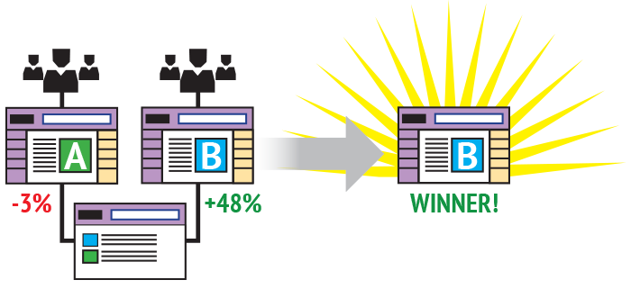
To address this challenge, we found that performing simple A/B Tests on key screens, which have the highest impact on conversion rates, provides the most powerful business case for why investing more in enhancing the user experience should be a top priority. A/B testing is a simple way to test changes to a page or set of pages against the current design and determine which changes produce positive results. Typical A/B Tests only require a couple of weeks to perform, and the knowledge gained, and the increased revenue can easily justify and quickly pay back the investment.

To bring it back to a brick-and-mortar store, imagine you had two separate stores. Each store got the same amount of foot traffic. Store A is staffed with sales reps that use the same sales tactics that you’ve always used and Store B uses a new, different sales tactic. After a couple of weeks, you analyze the sales generated by each store and you find that Store B outperformed Store A by 10%. So you immediately implement Store B’s sales tactics in all your stores. That’s A/B Testing.


