Unwrapping our 2024 Figma wishlist
Another year has passed, and our list of wishes for Figma has grown. We have been excited to see some of our wishes from 2023 come to life, along with many other helpful features. Figma is great at listening to its users, so we are hopeful going into 2024, our wishlist will be fulfilled.
Since the Adobe / Figma merger is canceled, here’s what we think Figma should do with the $1 billion they just got from Adobe.
Multiple actions on a single element
This one is a repeat of last year. In prototypes, we need the functionality to show hover and click events on the same instance. Many of us are visual learners and need to see how something works to understand it. This is especially true for people outside the design industry. With this functionality, clients could see how the interactions work rather than being told how they should work.
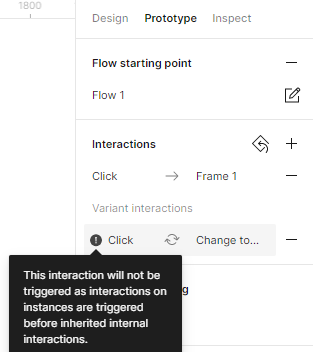
Click interactions are limited to one on the same instance
Variable enhancements
Figma announced Variables as part of their 2023 Little Big Updates. Variables allow for huge flexibility and are a powerhouse for designers to incorporate into designs and prototypes. Here are a few examples of what variables are capable of:
- Toggle a design between Light and Dark Mode
- Apply different spacing across devices, like Mobile and Web
- Vary how elements are displayed in prototypes using conditional logic
Variables are still in Beta, so we expect additional functionality to be incorporated. However, we would love to see:
- Text style variables, like font size and weight
- Duplicate variable groups
- Import/export variable collections from design files

Number variables that can be applied to any text property
Design file organization
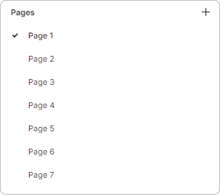
Imagine you have 50 sheets of paper lying on your desk and are looking for a specific sheet. You may need to dig through the entire stack to find the one you need. This is similar to how it is to find a page within a large design file using the Pages panel.
To remedy this problem, we can look at any operating system or application that has a file system – they use folders and subfolders. Figma can mirror a file system with hierarchical sections and subsections for users to organize their pages. To make it even better, those sections should be collapsible.
Number Variables that can be applied to any text property
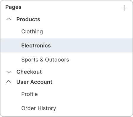
Enhanced pages panel with organized, collapsible sections
Highlight detached color styles
Currently, libraries allow us to work more effectively on a project, make it easier to follow the design system and keep designs consistent. But what happens if a color style gets detached from an object? The same color is still being used, but without the style applied, any changes to the style will not be reflected on the object.
For example, a text element with the color #000000 matches the defined ” Text ” style with the color defined in its properties. Figma could flag or highlight the non-styled object to use the matching style.
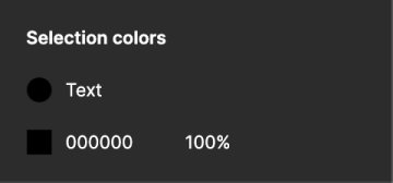
Selection colors panel with a color style and hex code
Enhanced table layouts
Dealing with diverse content in big data tables is a challenge, isn’t it? The auto layout works wonders for organizing things horizontally, but aligning column content… that’s the next step. Imagine having a feature that automatically aligns column content within these tables. It could be a game-changer, ensuring neatness and coherence, even when each column is packed with different elements.
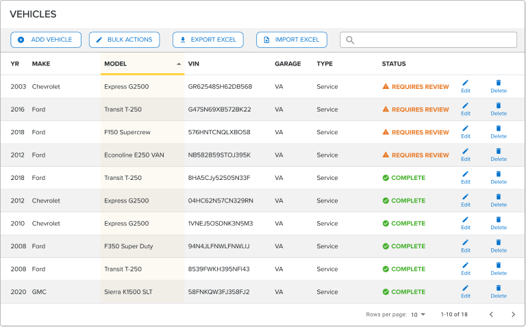
Data tables can benefit from an enhanced auto layout feature for perfectly aligned data cells
Intelligent frame naming
Renaming frames, especially in large projects, can be a huge task. Figma could lend a helping hand here by suggesting names when you create a new frame. Instead of automatically naming frames based on their sequential number, like Frame 1532, it would be great to have easily identifiable names generated. For example, Figma could detect that a frame has a background color with text centered horizontally and vertically and name it “button.” This feature would significantly streamline file organization for users and make life a lot easier.
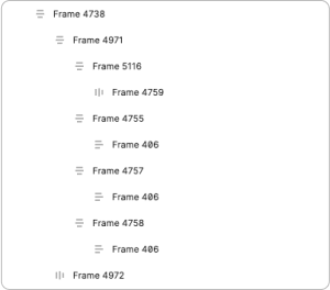
Current pages panel with no file structure
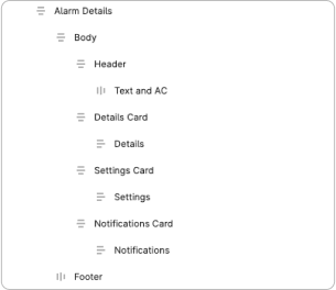
Enhanced pages panel with organized, collapsible sections
Eyedropper picker for text styles
We love Figma, but one thing we miss from Adobe is the “eyedropper picker”. The Figma eyedropper tool currently only picks up color. We’d love it work like the eyedropper in Adobe Illustrator and pick up the typography styles as well. Of course, the” option + command + C” shortcut does copy styles, but it’s not as easy as Adobe’s “I + click the style you want to copy”.


Eyedropper picker to clone text styles to current element
Background blur for overlays
Some things are easier to do in code than Figma. Background blurs for overlays are one of them. Background blurs in prototypes would be especially helpful for overlays in dark mode, where the background color differentiation is less noticeable.
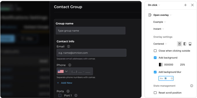
Prototype with background blur setting for overlays
Simplified sharing links
Sharing designs within a team is a crucial part of collaboration, but sharing an infinite canvas like the one you linked to can be a bit of a headache. What if Figma simplified this by generating quick, contextual links based on the frame title? So, rather than dealing with an unwieldy link, it could just be something straightforward like “Figma 2024 Wishlist.” Easy, efficient, and much more user-friendly for sharing and reviewing designs.
It’s amazing how small enhancements like these can significantly impact user experience, right? Figma’s already a powerful tool, but these tweaks could take it to the next level, making design workflows smoother and more intuitive for everyone involved.
That’s a wrap
Wishing you all a sleigh-full of design delights and pixel-perfect dreams!


