Why the Google places API search failed our usability tests
Whenever we perform usability tests, we inevitably discover something we didn’t expect — which is exactly why we test. In this case, we were designing a quoting system for insurance agents and the primary success criteria for the project was to “increase quote submissions by making the quoting process dramatically faster and easier for the agents”. When it comes to streamlining any complex process, it’s usually a lot of little tweaks that add up to significant time savings. For this quoting system, one of those things was the “Business Name” field. During our user shadowing sessions with the users, we observed how laborious and error-prone it was for users to enter the business name every time they created a quote. So, we suggested implementing the Google Places API Search, on the Google Maps Platform, which we’ve used on many other applications before with great success.
For this application, our stated hypothesis for using Places API was this:
“We believe that by replacing the text input field with the Google Places API search feature, we will optimize the overall efficiency of this required field for the following reasons:
- Redundant data entry will be reduced because the user can select a business from the results set after typing just a few characters
- User input errors will be reduced because the users will select a business from the search results
- Data quality and data mining capabilities will improve because businesses are motivated to keep their Google listings up-to-date because so many customers use Google
- Google’s Instant Autocomplete functionality is familiar to most users because of Google’s widespread usage and adoption”

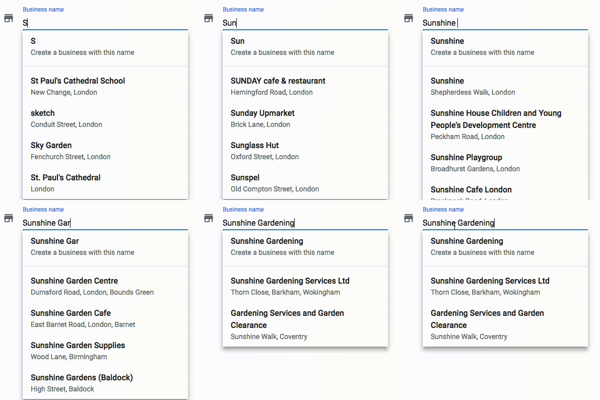
Google's 'familiar' instant autocomplete results
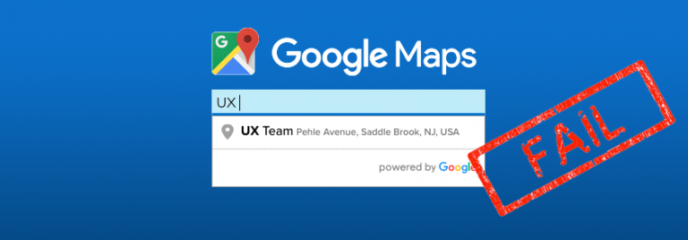
Since its official launch in 2008, most people have grown very familiar with how Google’s Instant Autocomplete search results work. You start typing something in and Google immediately starts to show you matching results that you can select. With Google’s Place’s API (shown to the right), a user begins to type a business name and Google immediately starts to display matching business names that are closest to the user’s location and they have the option of either selecting from the Instant Autocomplete results or selecting the option to create a new business listing.
The surprise
In our initial usability tests, not a single agent selected a business from Google’s Instant Autocomplete results that displayed right in front of them as they typed. Instead, every one of them either typed the full business name or they copied and pasted the business name into the field from another data source. To be clear, we are not saying that Google’s Instant Autocomplete results are poorly designed, we are saying that when we implemented the feature in the redesign of an insurance quoting system, this ‘familiar’ feature was not used by agents as we expected it to be used. In fact, we were so baffled by the failed test results that we decided to test it again with non-agents just to see if we could narrow down the root cause of the failed test. As we suspected (and hoped), all non-agents selected from the search results rather than type the full business name or copy and paste it into the field.
The lessons learned
So why did such as familiar feature fail our usability test? We believe the primary reason was “Learned Behavior”. The agents we tested all use many different insurance quoting systems and not one of them uses Instant Autocomplete results for the Business Name field. Instead, as flawed as it may seem, they all use a simple free-form text entry field that requires the users to type in the full business name. So, the users are simply used to typing the full business name instead of selecting it because within the context of an insurance quoting system, that’s what they’ve always done.
The solution
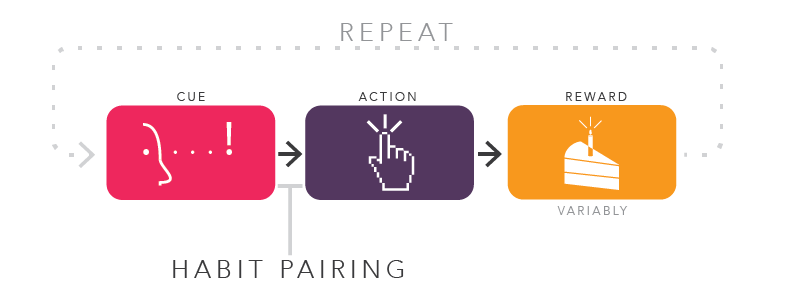
So how do we change the way the agents see this Business Name field so that they use it more as a search box instead of a text entry field? We took a page from the Cue → Action → Rewards (CAR) Model in Behavioral Design, which is a proven design framework for inducing user habits.
In the case of this one Business Name field, we needed to make it visually obvious (Cues) that the results were ‘selectable’ so that it encouraged users to click (Action) a result. This would mean less typing and errors, and it would provide an opportunity to pre-fill a lot of data within the quoting system based on the unique ID of the selected business (Reward!).
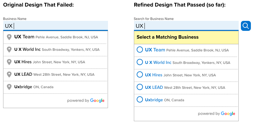
Here's what we did
- Added the word “Search” to the field label name and added a search icon as Cues to get agents to use this field as a search box rather than a text entry field.
- Added the “Select a Matching Business” (Cue) to encourage a selection (Action) from the results set.
- Added radio buttons (Cue) to the results to further encourage a selection (Action).
- Colored the business names in the results set blue (Cue) to help indicate that they are clickable.
- The Reward is then fulfilled by typing less, and on the next screen, a message informs the user that data was automatically pre-filled for the selected business. We hope this will encourage a repeat of the same use the next time the agents use the Business Name field.
All this for a single form field?
Yes. In order to “increase quote submissions by making the quoting process dramatically faster and easier for the agents” we needed to get this first form field right.


