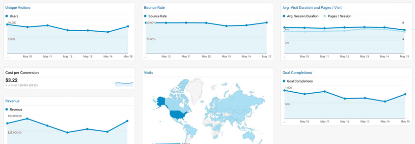

A good UX Team will utilize activities such as user interviews and surveys, data analytics, card sorting, usability testing, and A/B multivariate testing to help drive the design of the user experience toward one that is focused on data. These activities are also helpful in overcoming the influence of the many personal opinions that inevitably enter a project during the design phase. We have found that nothing ends a design debate quicker than asking someone to produce data to support their statements.
On one project, the marketing team asked that their website use a specific navigation structure with specific label names for each section of the site. However, when we performed card sorting exercises with 10 potential customers, we found that the way their users logically grouped or categorized content went completely against the direction of the marketing team. When we presented our findings, it quickly became obvious that we can either design a navigation system that the users have proven to understand or use one that no one understands.
Not only can UX activities help drive design decisions but they can also help drive decisions about what areas of a site or application need the most help. For example, during an e-commerce redesign project, we analyzed the data in Google Analytics, and we found that the bounce rates and conversion rates for their shopping cart were not even close to where they should be. As a result, we recommended a parallel design effort that focused on enhancing the existing shopping cart design to help convert more visitors into buyers. Even though the client was originally dead set on having us focus on a complete design overhaul, we convinced them that spending a little bit of time on converting more of their visitors into buyers would enable them to see revenue gains quicker than waiting for the full redesign to be complete. In addition, we also implemented A/B tests on key areas of the shopping cart that helped inform our design decisions for the full redesign.
On yet another project, an IT department insisted on naming their section on a corporate Intranet “Help Zone”. During card sorting, employees were asked to create piles of cards they felt were related and then either name the piles or select a card that best matches the pile. Almost all employees created a single pile for all the things the IT department was responsible for, such as computers, phones, printers, etc… When we asked them to name the pile, most employees simply said “Tech Support”. As part of our card sorting practice, we always designate a “Not Sure” area for users to place cards that they’re not really sure what they mean or where they should go. Not only did “Help Zone” end up in the “Not Sure” pile, but when we asked what the users thought “Help Zone” was, many thought it was either help with the Intranet or help with the screen they were on.
| Cookie | Duration | Description |
|---|---|---|
| cookielawinfo-checkbox-analytics | 11 months | This cookie is set by GDPR Cookie Consent plugin. The cookie is used to store the user consent for the cookies in the category "Analytics". |
| cookielawinfo-checkbox-functional | 11 months | The cookie is set by GDPR cookie consent to record the user consent for the cookies in the category "Functional". |
| cookielawinfo-checkbox-necessary | 11 months | This cookie is set by GDPR Cookie Consent plugin. The cookies is used to store the user consent for the cookies in the category "Necessary". |
| cookielawinfo-checkbox-others | 11 months | This cookie is set by GDPR Cookie Consent plugin. The cookie is used to store the user consent for the cookies in the category "Other. |
| cookielawinfo-checkbox-performance | 11 months | This cookie is set by GDPR Cookie Consent plugin. The cookie is used to store the user consent for the cookies in the category "Performance". |
| viewed_cookie_policy | 11 months | The cookie is set by the GDPR Cookie Consent plugin and is used to store whether or not user has consented to the use of cookies. It does not store any personal data. |